The Winebow Group
Website Design
Every now and again, when I'm browsing Netflix, I decide I'm going to binge all of the documentaries in my queue. During my last binge, I watched the documentary SOMM, a film that follows four sommeliers through their journey of intense study and rigorous testing in their quest to achieve their Master Sommelier diploma. I was blown away by all of the facets wine — facets I had no idea existed! These experts are required to name a wine, its vintage, region, varietal, etc. after a blind tasting. Their palates and wealth of knowledge blew me away, and I was very excited to learn more about this world of fine wines and spirits with The Winebow Group.
Challenge
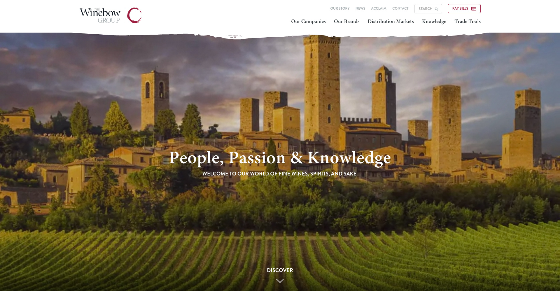
The Winebow Group is a massive company. Two years ago, The Country Vintner and Winebow companies merged to form The Winebow Group. They had a shared vision - passion for their people, products and knowledge - and combined forces to serve as much of the United States fine wine and spirits markets as possible. The Winebow Group has continued to grow since the merger, adding additional import and distribution member companies (totalling 13 companies at this moment) to its group to continue to provide excellent service to additional markets.
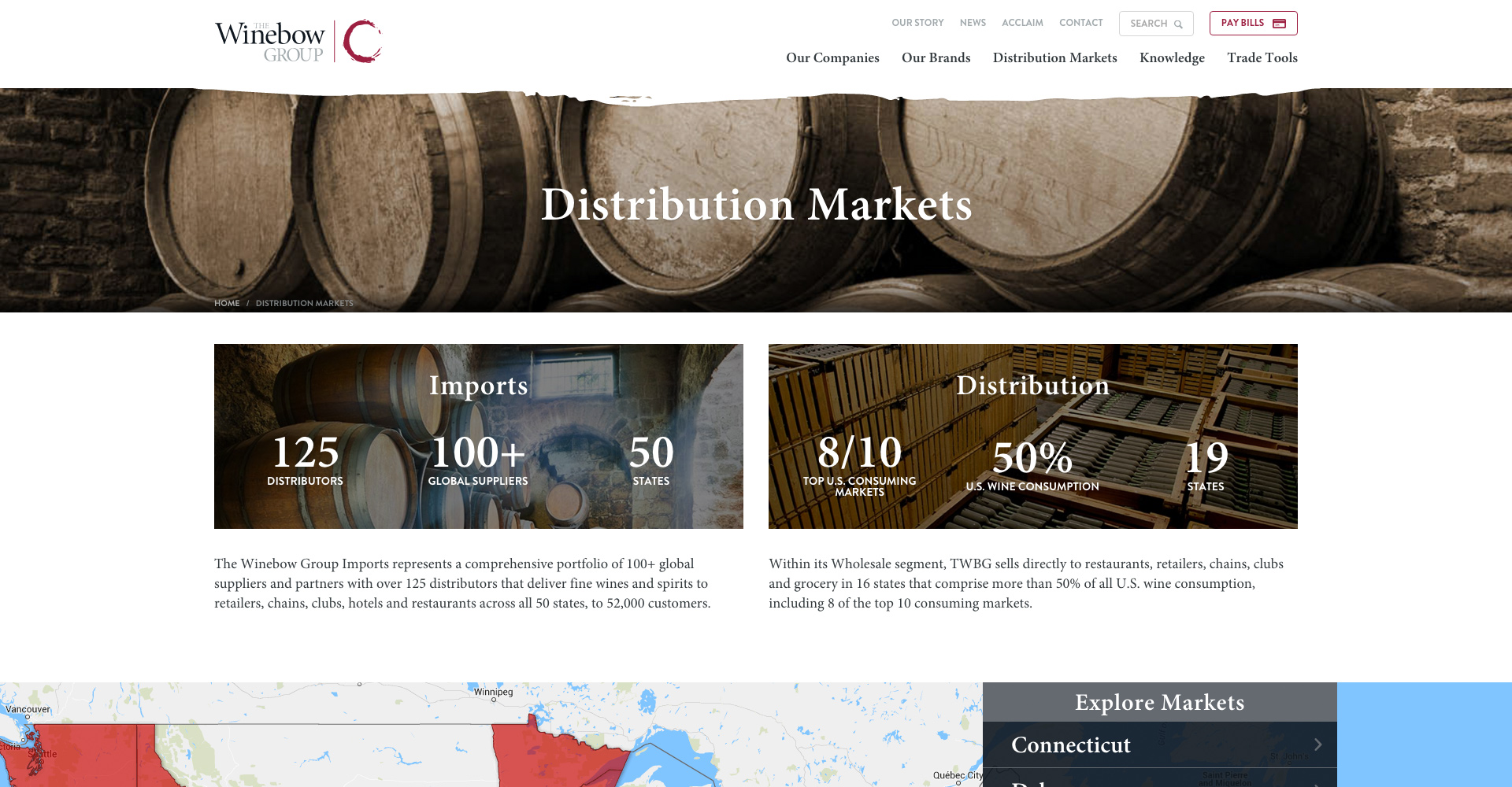
Each project's challenges are what makes the projects fun, and one of our biggest challenges was the scale of this project. The Winebow Group has sub-companies, brands, products and a variety of stakeholders. Ensuring that this new site clearly communicated The Winebow Group's story and mission, how the companies operate and the brands/products that they offer required a lot of research and time working with The Winebow Group to figure out how all of these pieces fit together.
Solution
Strategy
Before I begin a project, I sit down and go through any research and documentation I have for the project. As a part of preparing for the project, I carve out time to go through the client's current site and create a sitemap for the site. I click on every link, I search for content that might be hidden and I map out the content that exists and the relationships between the content.
After going through this exercise with The Winebow Group's site, I realized that the amount of information on this site was more extensive than it appeared. It became very clear that, as part of our initial research and discovery work with The Winebow Group, needed to identify the audiences the information was for and how the site needed to be used by each of these user groups.
We conducted a series of interviews with key stakeholders and to identify their objectives for the new site. After spending a few hours talking with these stakeholders, we decided to send surveys to some of the main users of their site, focusing specifically on their sales team. After receiving the feedback from these key groups, we compiled the data and created documentation to help inform our decisions: organized and prioritized site objectives and personas for the user groups to help us prioritize actions and decisions as we dug deeper into the project.
Organizing the information on the site into explicitly clear sections was a big challenge, and we worked through a few versions of the information architecture before settling on the final version. Understanding the information hierarchy was challenging in some ways, so we moved quickly into wireframes to create more concrete examples of how the new site would be structured and how its functionality would work.
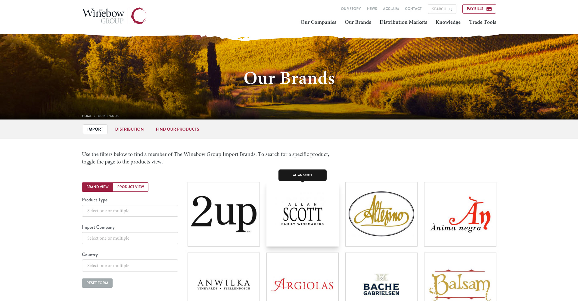
Some of the most utilitarian portions of the site centered around the brands and products available through The Winebow Group and its member companies. The sales team uses the site regularly to put materials together to help educate others about the brands and products they can choose from. With hundreds of brands, thousands of products and reviews/acclaim for these brands and products, the mountain of information to be sifted through was impressive. These types of information exist in multiple areas of the site, and we created consistent design components and interaction patterns through utilizing navigation & bread crumbs, tables and multi-select data tables with view options to make finding and sorting the information easier.
Design & Development
Our design team focused on leveraging an atomic design system and pattern library for this project. One of our designers, Jereme, began the project working through the homepage design. Once the look and feel of this page was established, our lead designer, John, designed the list of remaining components identified in strategy and we worked in-tandem to assemble the remaining templates to be designed for the site. We iterated this design many times to refine the elements and create a design that embodied The Winebow Group.
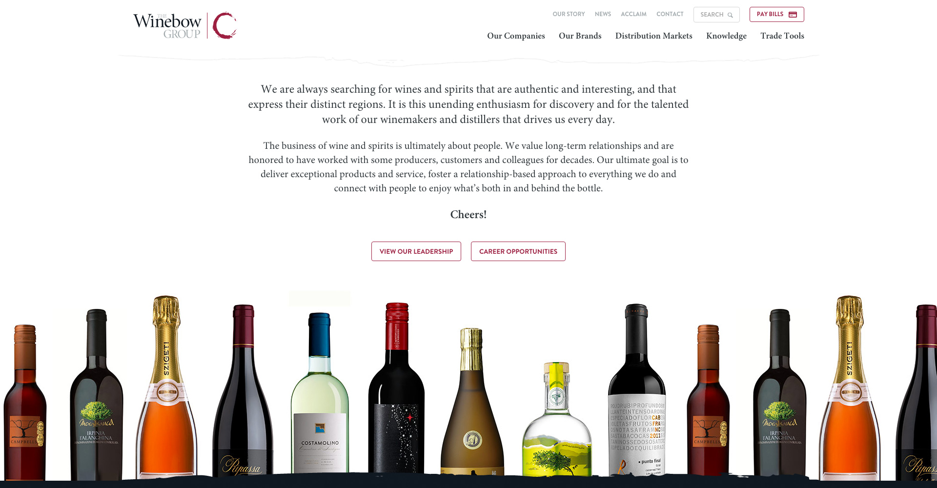
Once we finalized the designs, John moved straight into development and created the front-end of the website. We partnered with The Winebow Group's web team, CHCS, who is responsible for maintaining The Winebow Group sites and data, to build the new site, with our team responsible for the front-end and their team responsible for the back-end and data integration of the new site. CHCS did an amazing job and we are thrilled with the results of our work together.
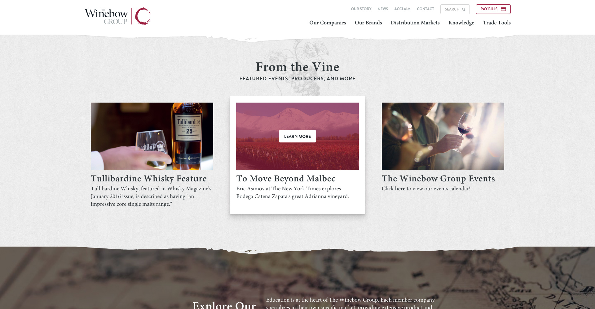
We very much enjoyed working with The Winebow Group and CHCS on this project. I especially loved speaking with The Winebow Group's people to learn more about the company and what makes it special. Every person I talked to was equally passionate about their work and their company, and it was refreshing to see such a great group of people coming together to be the best they can be and provide the highest level of service possible.
Team
- Caitlyn Mayers, UX Lead & Visual Designer
- Sarah Sheldon, Project Manager
- John Heiner, Project Lead, UX & Visual Designer, Developer
- Jereme Yoho, UX & Visual Designer
- Jordan Maslyn, Developer
- Work done at Colab