Unboxed Technology
Website Design
Unboxed Technology is a company that creates simple training and sales enablement tools and the content that powers them to assist companies with helping their employees do their jobs better. Unboxed has a product team in-house that had previously been responsible for all of their internal product work, including their website. Unboxed saw the value in working with another team of experts and decided to partner with Colabto help them create their new site.

Challenge
Unboxed reminded me of when Shrek described Ogres being like onions. Unboxed is very layered - they offer many products and services that are all related but are tough to fit onto a neatly organized system. Because of this organizational challenge, their old site contained a bunch of helpful information, but there was a lack of hierarchy and focus that made it very difficult to understand what exactly it is that they do. Putting all of the pieces together and into place was a big challenge, but was much less of a challenge once we were able to dig in and really understood what Unboxed's core is and how that influences everything they create as a part of their products and services.
Unboxed is agile, which is great. They are able to iterate, adjust and refine the products they make and the services they provide. Because of this agility, their new site needed to be as flexible as possible. The second aspect of the challenge with this project was creating a modular, expandable and fully-controllable through Wordpress site that would allow them to iterate and refine on their website as much as they do with their products.

Solution
Strategy
Working on this project was delightfully collaborative on many fronts. We worked closely with Unboxed's marketing and content teams to nail down a content strategy before considering inching toward design. There's nothing better than designing with real data, and the ability to work with their team to shape the strategy and work through actual content on the site was an excellent way to work (and the only way, if I might add.)
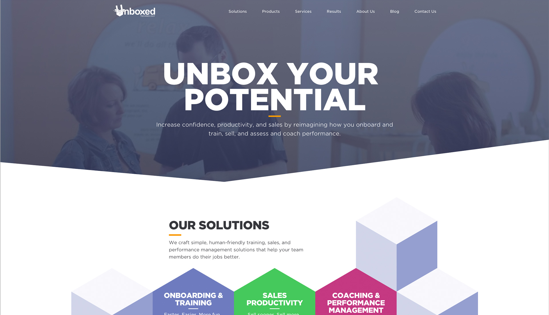
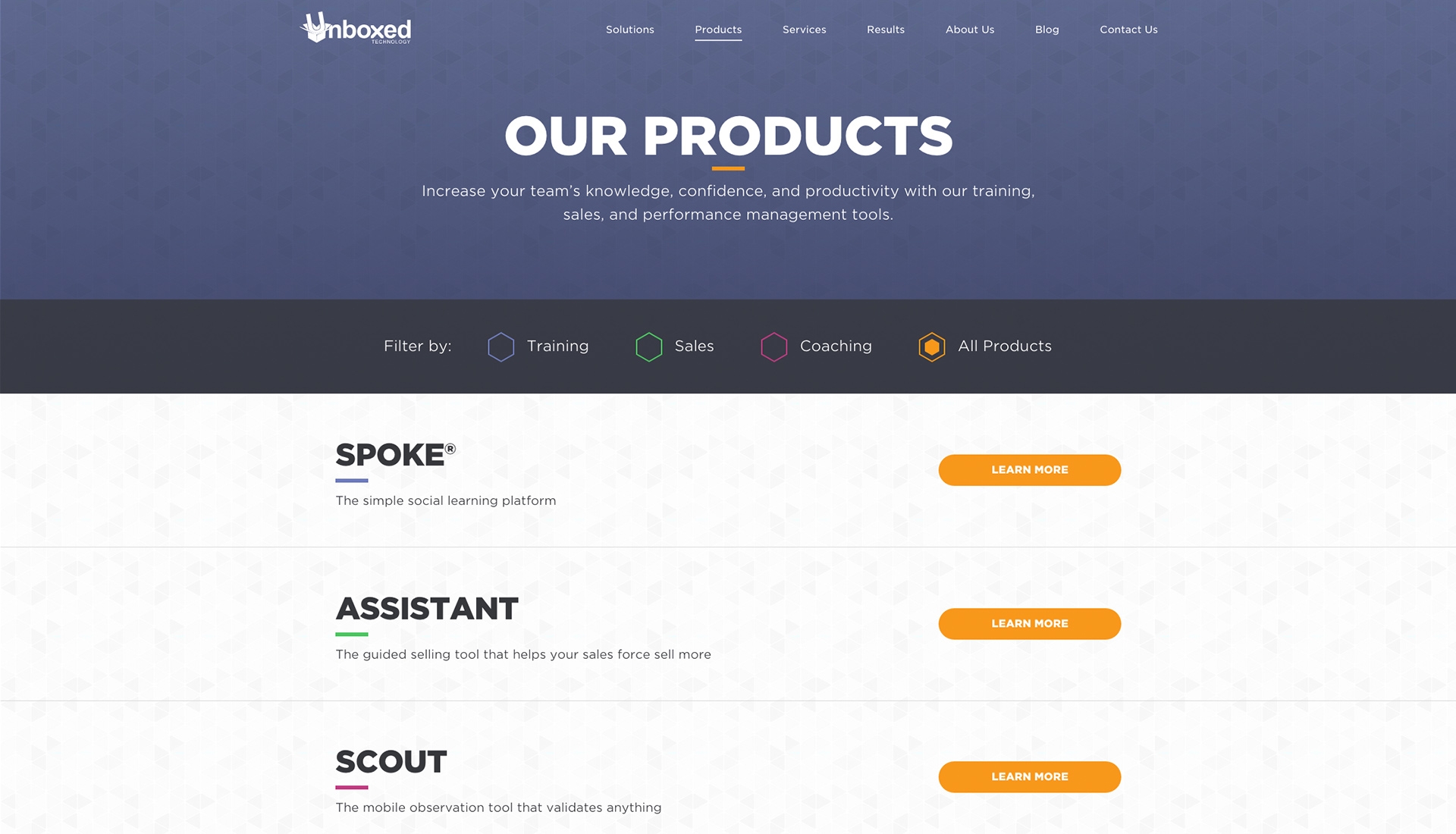
We created a new organizational structure and hierarchy that is centered around their products and services. It was very important to us to make sure that the distinctions between the products and services were explicitly clear. Unboxed has created a product suite that serves as an ecosystem of individual products that each meet a specific need of the employee journey — Onboarding & Training, Sales Productivity, Coaching & Performance Management, and we used these three groups to help create additional content relationships.

One of the most important ways we were able to create relationships between their content types was through the Results section. It’s one thing to talk about what a product is and does, but what really establishes the importance of utilizing Unboxed’s products and services together is the success of the solutions they’ve been able to deliver for their clients. By placing this content in its own section, we were able to maintain a hierarchy of information throughout the site, helping us keep the content sharply focused on what matters within the section's context and reduce the amount of noise on the pages that had previously been an issue.
Design
Our lead designer, John, and I worked in tandem on this project through the design of the site. The project was phased – the design of the first phase was executed by John, reviewed internally, and, once approved, then handed off to me to complete the remaining work in the second phase. Working this closely together was challenging but rewarding. It forced both of us to try new and inventive things and also resulted in me chastising John for his messy PSDs.
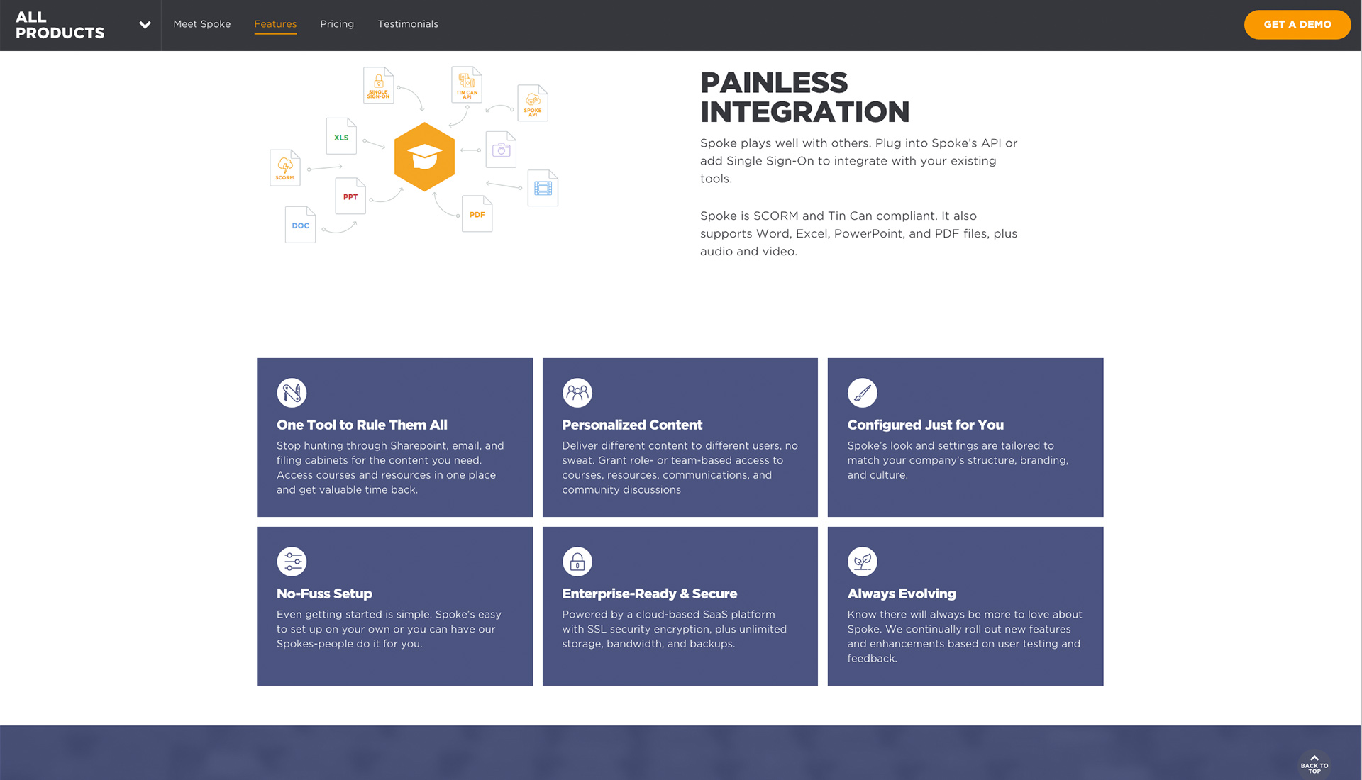
We worked through many iterations of this design than we normally have in the past, which helped us hone in on details, most importantly consistency and modularity. We designed the site to be a series of modules and components used throughout the site to give Unboxed a large amount of flexibility within a consistent design system.

We focused on adding depth to their brand, adding more sophisticated design elements but also making sure not to forget to add a dash of fun to the site. Because Unboxed is constantly iterating, we created design elements to support their efforts to continually create and adjust the elements of the site. We set the boundaries and gave them the ability to control icons, colors, layouts of pages and assets at every turn.
Development
John did a phenomenal job translating this site from static assets – wires, sitemaps, comps – to a living, breathing, delightful website. His attention to detail on this site is one of the things that makes the site so special. He incorporated fun hover animations and motion effects, background video, elegant page transitions and element loading styles that I feel elevate this site's design.
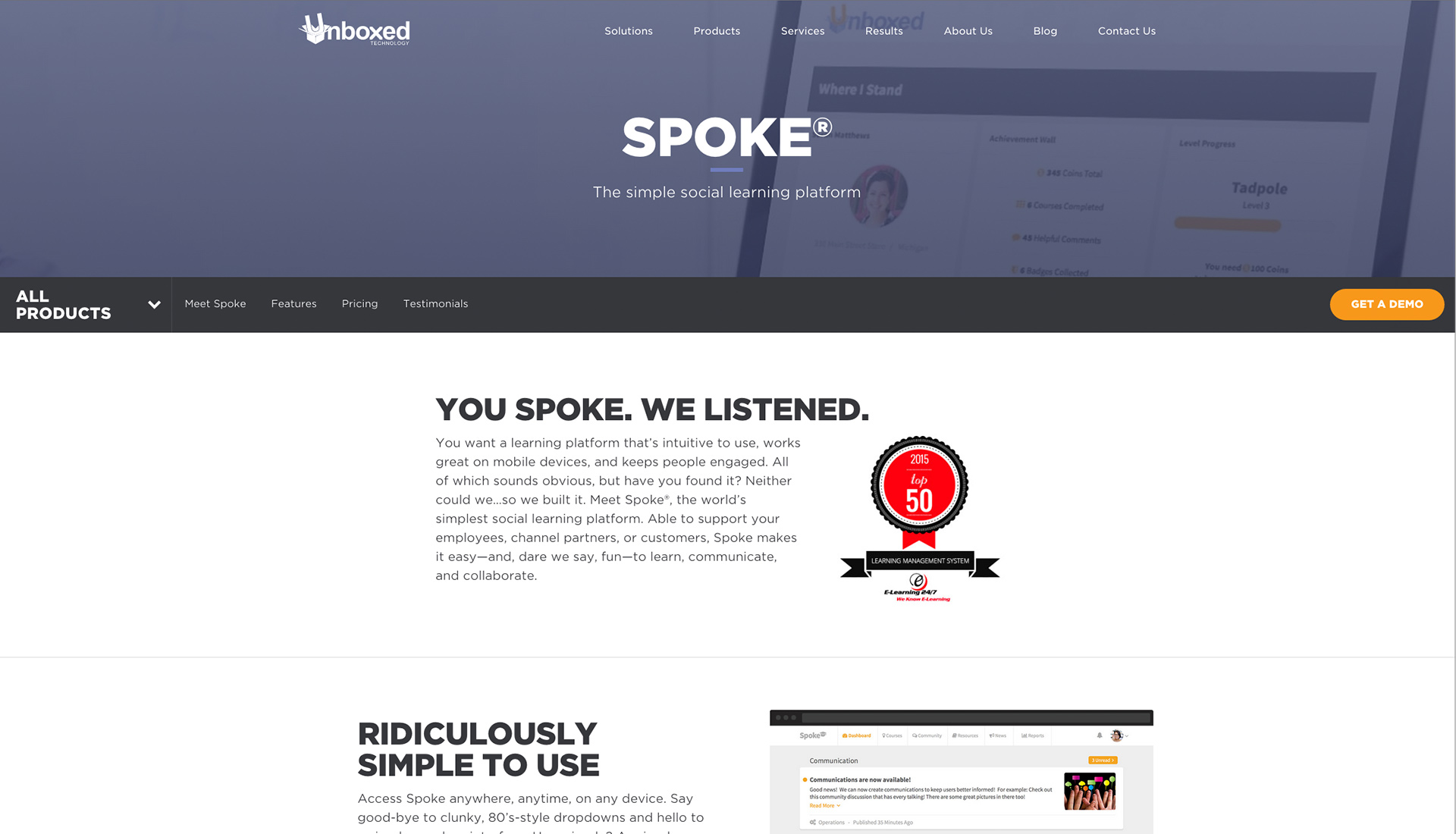
When I mentioned that this site needed to flexible, I meant it. John created a system of content modules with ACF Flexible Content that allows multiple configurations of each module in any layout order they choose. These content modules included testimonial sliders, pricing tables, images with text, single or multi-device containers with images or galleries, and a content grid.
We used SVGs everywhere we could on this site, from sprites for animation to custom radio buttons. SVGs were also used to create the device containers in the modules to allow us to create easily responsive, scalable, lightweight, content-managed and device agnostic modules for showcasing products.
This project was equal parts fun, challenge and reward. I thoroughly enjoyed the level of internal collaboration, as well as collaboration with Unboxed to make this site a success. The site was in some ways very technically challenging, and we were able to build a site that meets their needs and performs very well.
I don't often like to use data as my sole indicator of a job well done, but after 2 months of Unboxed's site being live, their Goal Conversion Rate was up 500%, and that's something of which I'm incredibly proud.
Team
- Caitlyn Mayers, UX Lead & Visual Designer, QA
- Sarah Sheldon, Project Manager
- John Heiner, Project Lead, UX & Visual Designer, Developer
- Work done at Colab