Tableau Dashboards
Data Visualization & Design
One of my favorite things about being a digital designer is that the explosive growth in platforms and technologies allows me to continually learn and grow by flexing design muscles in a fun new way. At the end of 2018, I was asked to hit the ground running with a technical team using Tableau to help design a suite of dashboards for a large fast food chain in a 2 week sprint.
Challenge
The restaurant’s data monitoring team used a variety of siloed data sources to view the status and details of several internal initiatives, including the roll-out of a robust fiber network to its restaurants, monitor and reconcile transaction data and AWS costs. These siloed systems made it very difficult to quickly understand initiative status and serve as a reliable source-of-truth for real-time status. Our team was tasked with aggregating the live data from a variety of sources through creating Tableau dashboards, which would enable the team to monitor initiative status and progress over time and provide a direct line of sight into the granular details of each project, and we had just one sprint to complete the designs to support the quick release of this new dashboard functionality.
Initial Research
When digging into a new project, I spend time up-front outlining questions to inform some initial research around project needs so I have a better understanding of important factors that will impact our delivery approach. My two main questions regarding initial display and use case were:
- What type of screen (Large or Small TV? Desktop Computer?) and what size screen (High res? Low res?) will display the dashboards?
- How frequently will people want to change the data view of a dashboard?
I also took a deep dive into the design language of Tableau and the capabilities / limitations of the platform, especially when it came to the presentation layer. I’ve seen quite a few unrefined Tableau dashboards and wanted to better understand how we could refine them to meet a higher design standard. After digging into the options, we decided to use Tableau Server because it provided us with much greater control over the UI design and allowed us to create dashboards powered by Tableau that didn’t feel like your standard, out-of-the-box Tableau dashboards at the time.
Goals
I am a firm believer in establishing goals / metrics for success for each and every project. We established the following lean design goals at the outset to help guide our decisions and ensure we successfully delivered a usable product that exceeded expectations.
- Establish a clear information hierarchy based on persona needs to surface relevant information for the appropriate audience.
- Create a consistent and flexible design language grounded in the organization brand to establish a clear hierarchy and reduce cognitive load when analyzing data.

Solution
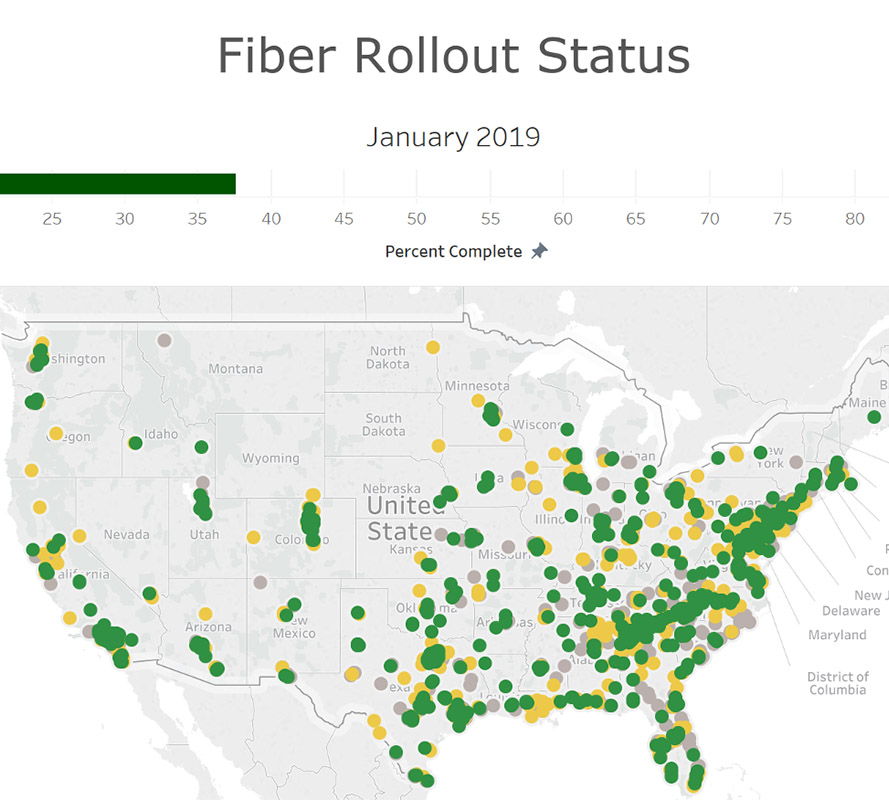
The Fiber Rollout Dashboard was what we focused on refining first, as it shows the overall progress of a phased rollout of high-speed fiber internet to the physical restaurant locations across the country. This rollout supported the real-time data monitoring efforts, so it was important to focus on monitoring this progress first because it supported the data powering the other monitoring initiatives.
Information Hierarchy
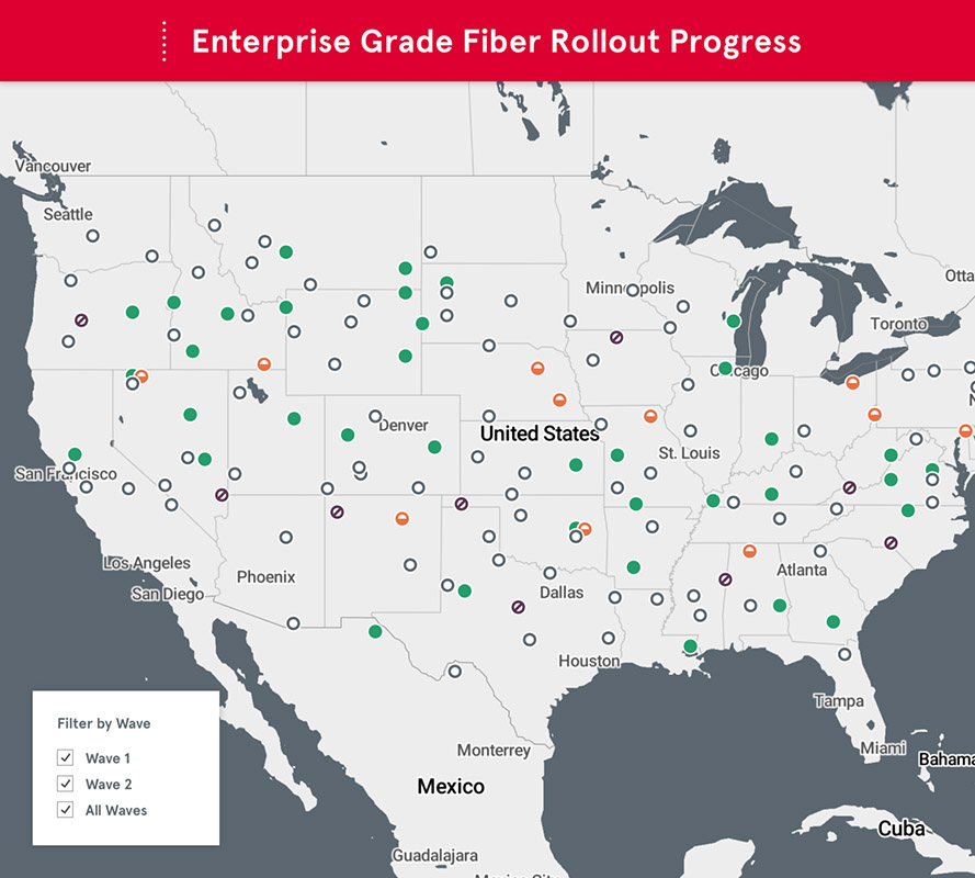
The highest priority information is displayed in the default view, focusing immediately on overall completion and progress, then breaking it down by the three main roll-out phases: completed, in-progress and scheduled, to address the needs of the Executive persona group. The Wave Detail views allow those monitoring the progress in real-time to dig deeper into the granular details of the phases to view that information.
Map Implementation
I styled the map to follow brand standards and also support a robust iconography system that communicated high value information. Tableau leveraged Mapbox to serve the map background, so I was able to create and style the map CSS through Mapbox, providing the development team with the URL to inject the map into the dashboard. This allowed me to quickly iterate and refine the map design without requiring any developer time and helped us move rapidly towards the final output.
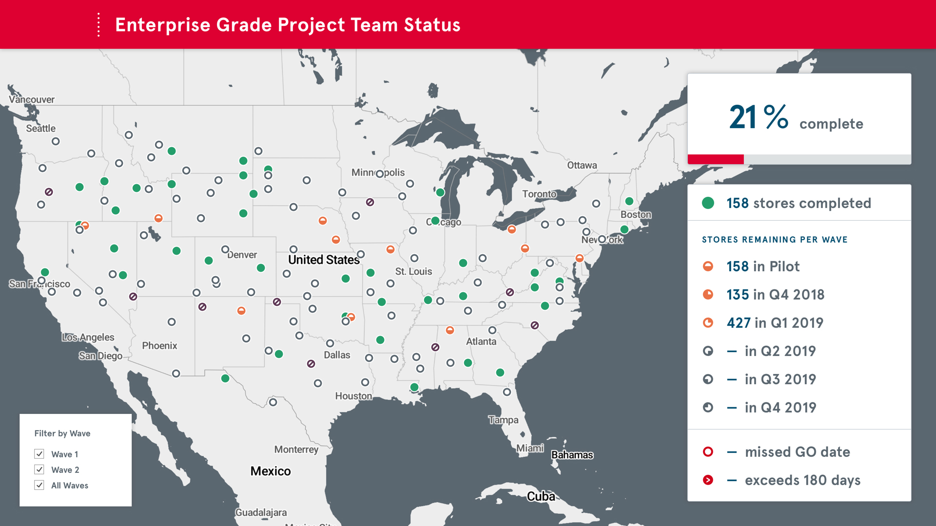
Color / Iconography System
We created an iconography / color system that communicated the status the roll-out locations on the map. Each icon shape represents a quarterly wave phase, with the icon shape visually demonstrating the quarter and the color representing the wave’s progress. This system relied on an already established visual representation of quarters to serve as a vehicle for pattern recognition and support faster understanding of what the iconography system communicates.
By establishing this system, we created a data visualization that was visually distinct and perceivable through both unique shape and color, ensuring it was perceivable by as many people as possible across the vision ability spectrum.
Another critical function of the dashboards was analyzing cost of the various system monitors and data sources, as well as transaction reconciliation and monitoring over time. With the emphasis in these views being change over time, the design needed to employ a specific hierarchy and communicate an increase, decrease or stasis in the data. Each of these change statuses could be positive or negative.
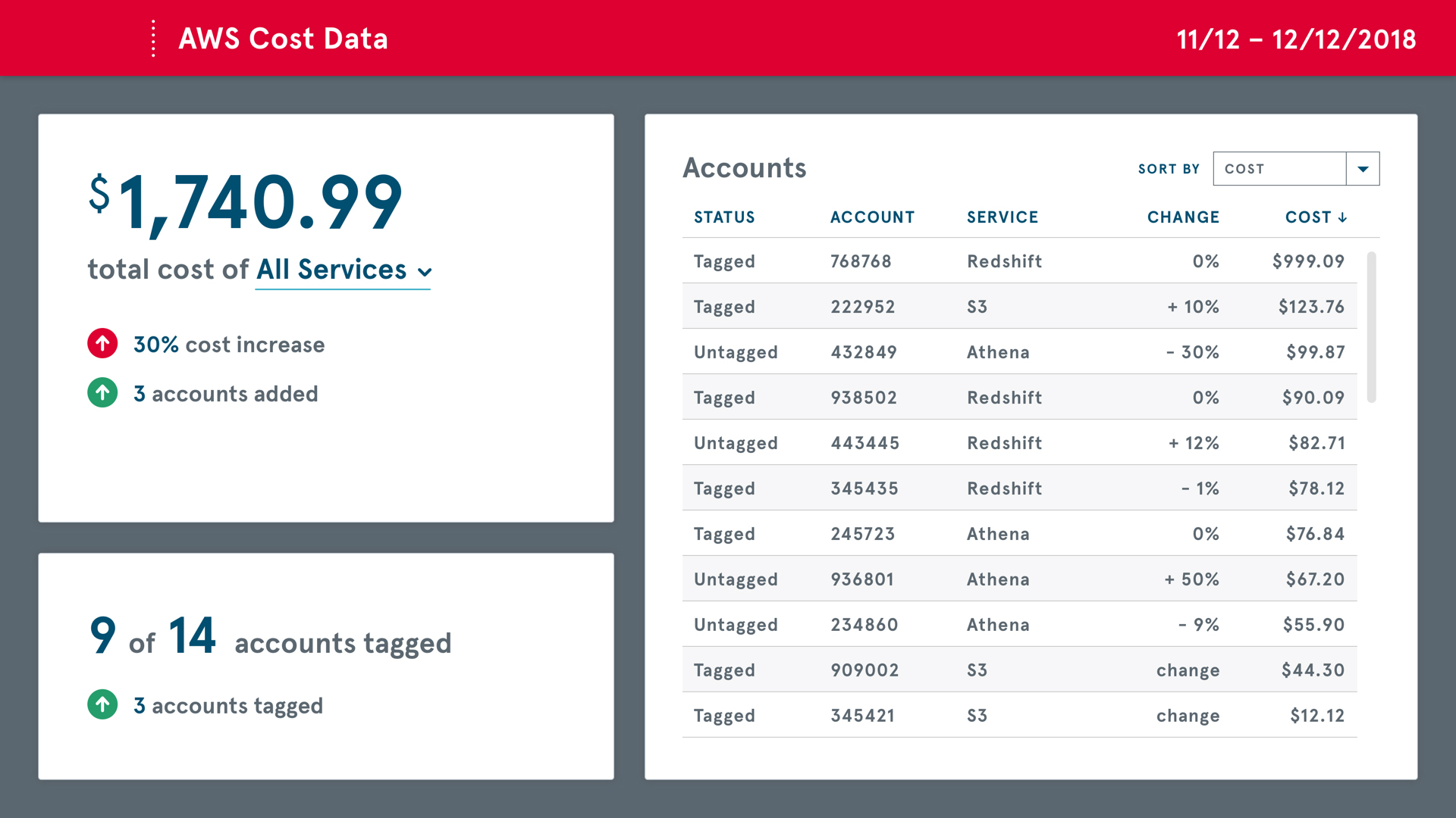
For example, an increase in overall cost, is not necessarily considered positive, but when contextualized with the additional data points of new accounts being added to the monitoring, a net positive, the data context becomes apparent and can be effectively evaluated. The iconography system here flexed to use directional arrows to indicate the direction of change and then relied on color and labeling of the data points as well to communicate a positive or negative change impact. If additional information was needed to better understand how the costs shifted over time, the data table on the right allows users to filter / sort the account data to better understand cost allocations.
I found myself doing the “across the room” test frequently as I was iterating through the dashboard design. I displayed the full-screen designs on my 4k monitor and walked as far away as I could (~15 feet) to ensure that the detains were discernible and understandable and the regularly tested on TV screens to ensure the designs continued to hold up in their final application.
Sometimes you need to buckle down and crank hard over a two-week period to do some fun, engaging work, and this project definitely scratched that itch.
Team
- Caitlyn Mayers, UX & Visual Designer
- Jacqueline Weiland, Developer