SEPTA Key
iOS & Android Apps | Product Design
Every now and again, designers tackle projects that at face value are simple, but as the team digs into the requirements and existing design constraints, everyone realizes that the problem being solved is not as straight-forward as it appeared. Constraints are what make the design process pure magic, and this project was no exception.
Challenge
A long-standing client, SEPTA, needed to integrate management of their new physical transit pass, SEPTA Key, into their existing iOS and Android transit apps. The CX Team had redesigned their apps several years back, and I was fortunate to be part of the small team that tackled seamlessly integrating these new features into the apps. While preserving the existing look and feel of the apps, we needed to design consistent experiences that used each platform's native design language to achieve the following goals:
- Display the Key information in an easy to access place within the app structures.
- Allow users to pair, add and manage one or more Key cards.
- Add the ability to view history information for trips and transactions.
- Create flows that allow users to create a new account or log into an existing account.
Before we started digging into the new architecture of the app and how we needed to integrate the new features and functionality, I cracked open the Sketch files from previous rounds of work to determine how easy or difficult it would be to work with the files to deliver the designs. Design files are opinionated in the same way code is opinionated, and how you organize and label your work impacts both your current teammates and the people that follow you after your involvement. I'm a huge proponent of well-documented design systems, and this project did not yet have one. The files were also not organized in any way, which added another layer of complexity to this project.
To make it easier to push global, consistent updates to components and screens across the app, I spent some of the first 2 weeks of the project creating a design system for each platform and replacing the existing screens with components and styles from the new system, which allowed me to rapidly execute the design updates across the entire experience for both apps and made it much easier for the designers that came after me to do the same.
Solution
After cleaning up the files and establishing the design systems, we determined it would be most efficient to work with the existing assets we had to deliver comps to the client but wanted to move quickly through the ideation stage before I moved into the design tools, so we focused on whiteboarding / sketching our initial thoughts so we could quickly test and easily iterate through the ideas with the client.
SEPTA Key Integration
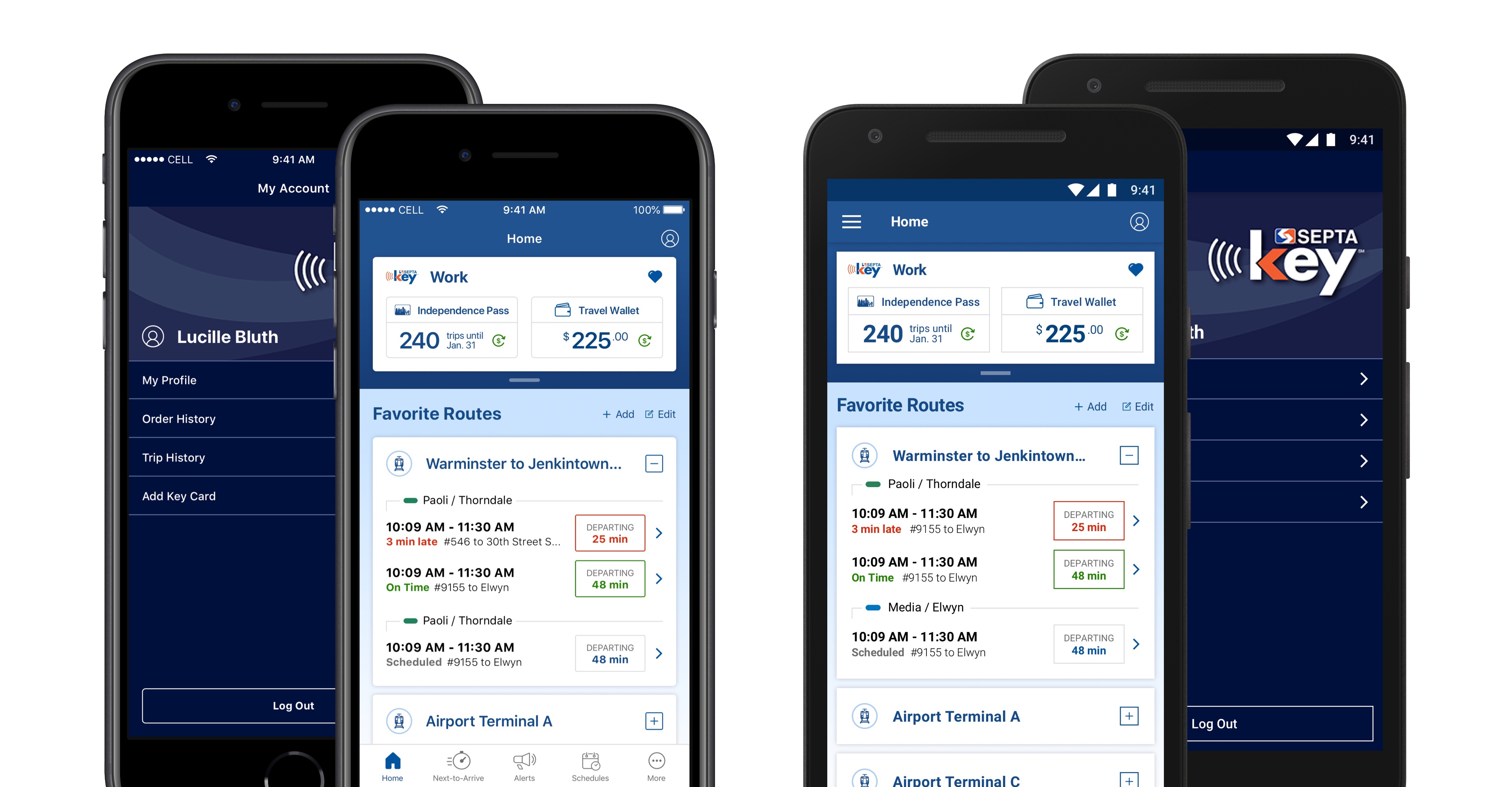
The first problem to solve was where we integrated the SEPTA Key into the existing app. We knew that it needed to be easy to access while on-the-go and determined that the Home screen was the best place to feature this information. The Home screen, however, already contained a user's favorite routes, which are crucial for determining when the next train a user needs will arrive, so we needed to effectively balance how these two pieces of information were displayed.
We added the Key to the top of the screen and extended the visual nav and top bar areas to contain the Key tiles. To keep the Key display streamlined to crucial information only on initial display, we opted for progressive disclosure of the other Key information that a user might need that are exposed by pulling down on the tab underneath the Key tile.
Because we were dealing with such a small amount of screen real-estate to display the Key information, we needed to do some user research to determine which information mattered most to users in the various use-cases around the Key in the app to help us prioritize the default display and the stress cases for which the design accounted. Most users of the app typically managed just 1 or 2 Keys, but users needed to be able to manage more than that number. Additionally, most Key users purchased a fare product, such as a transit pass, and kept an active Travel Wallet balance, but some users purchased multiple fare products and used them with their wallet balance, and was critical that the design supported all of these pieces of information concurrently.
To maximize the value of the integration and preserve the dual functionality of the screen, we again leveraged some progressive disclosure functionality by turning the Key tiles into accordions if multiple keys were present. Users can rename the cards to help them more easily differentiate between the Keys present using the unique name over the card number. We also added functionality allowing users to favorite one of the multiple cards, which would be open by default when a user opened the app and viewed the home screen.
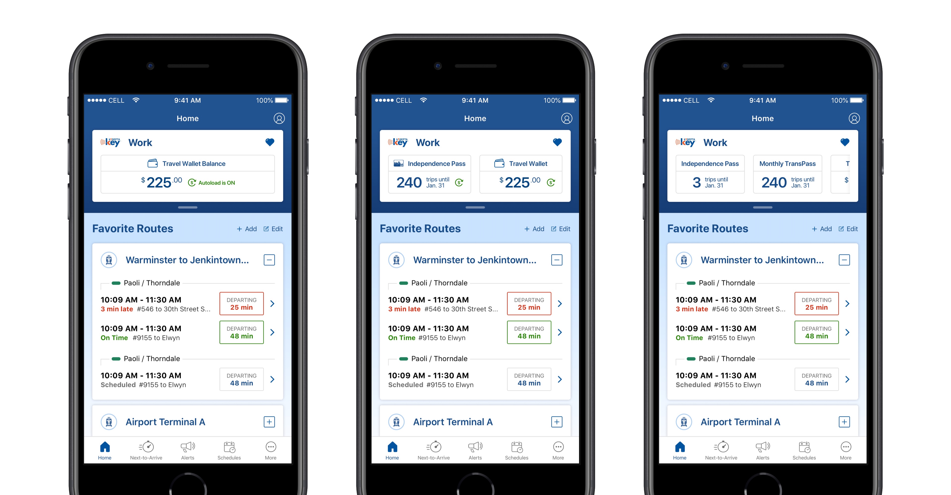
To support multiple fare products and the balance displaying together, we displayed the active passes first, followed by the balance. If there was more than one pass present, we reduced the width of the fare product / balance capsules and displayed part of the third capsule on the right of the screen to serve as the visual affordance users would need to know there was additional information present and that they could scroll to view it. In the event that there was only one fare product or Travel Wallet balance to display, the capsule became full width and displayed additional detail about the product, such as Autoload being on or off for that particular product.
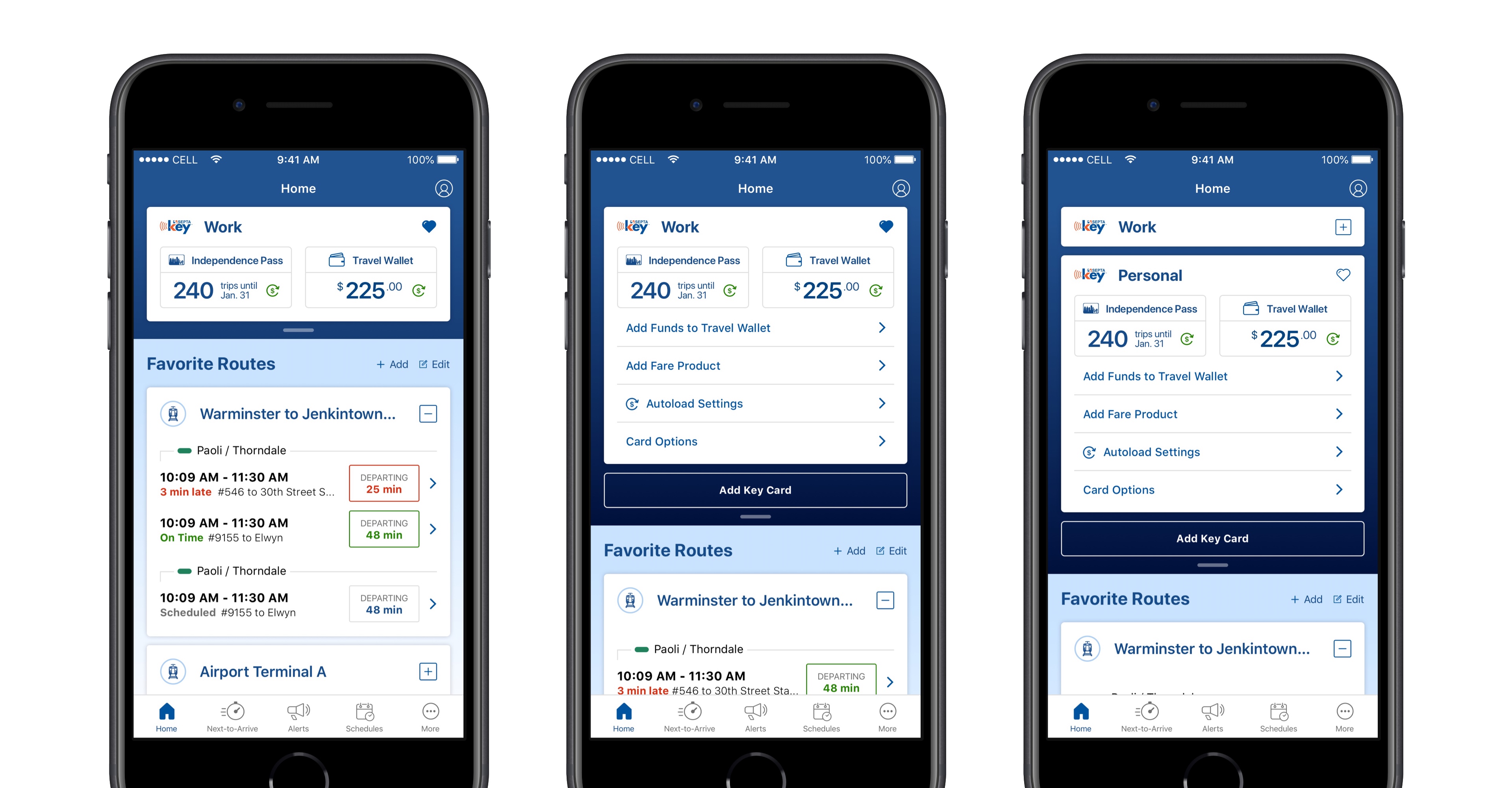
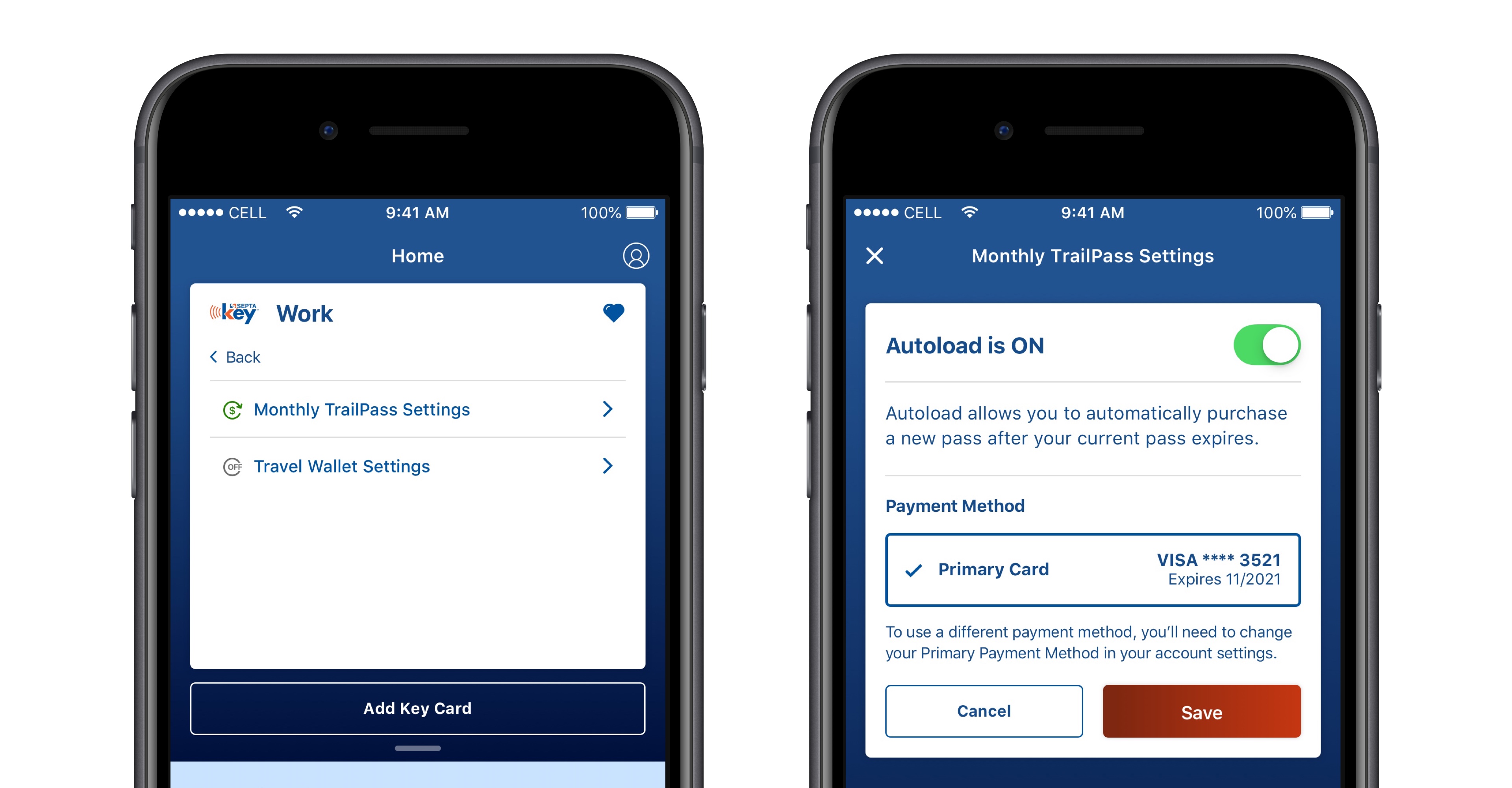
The last primary Key features and flows we added were the ability to refill your Travel Wallet, either manually or set it up to do so automatically, and the ability to purchase new fare products within the app. Previously, purchasing fare products was only able to be done at a physical location where passes were sold.
Account Integration
While adding the Key features, we also needed to solve for account management within the app, as that was not previously functionality available to app users. By expanding the top bar / nav bar in both app experiences, we were able to add the account menu in an intuitive manner.
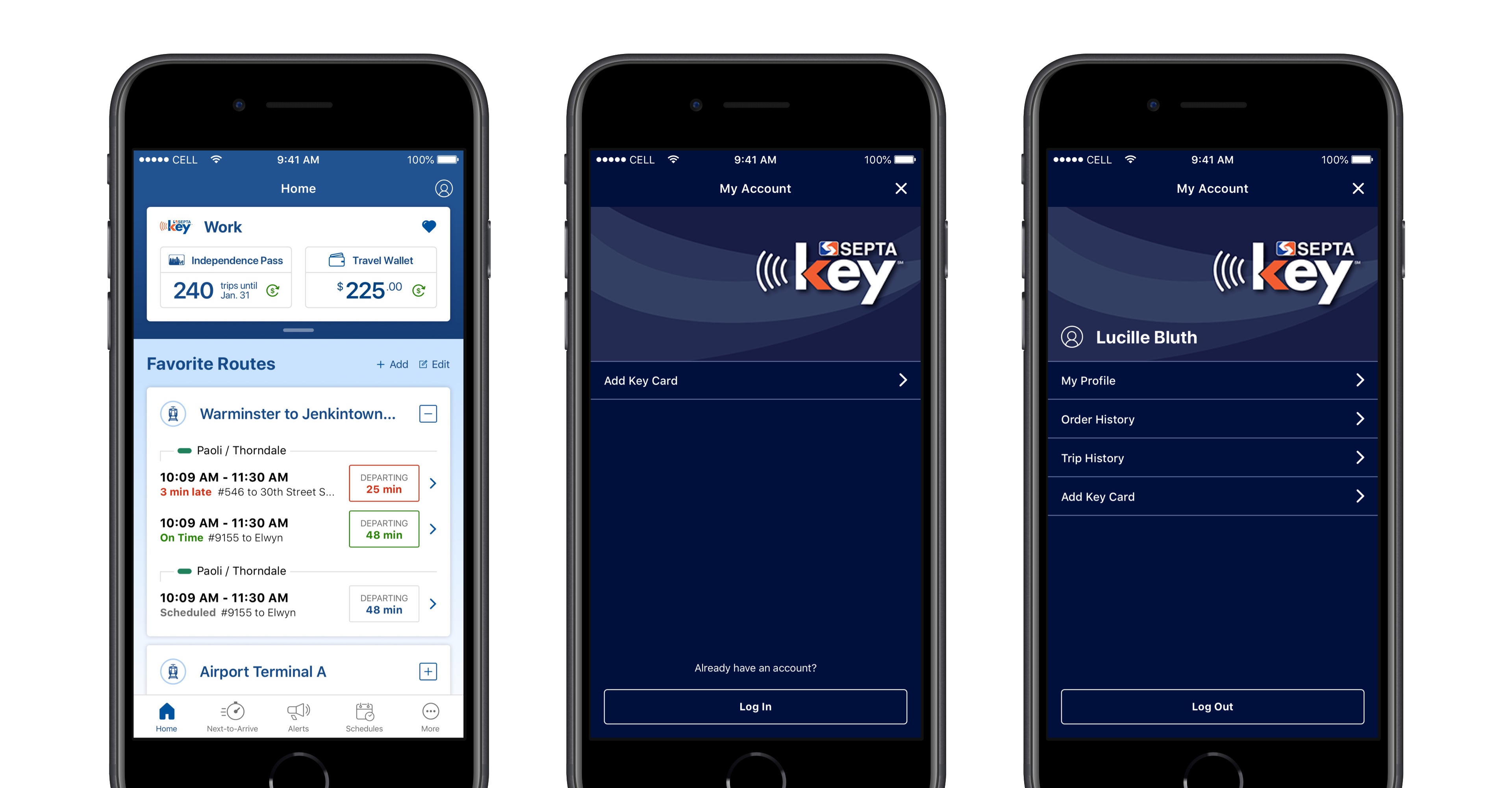
The SEPTA Key is a product that has its own branding and identity that is related to, but also unique from SEPTA's overall brand. Because there are slightly unique visual elements that underpin the SEPTA and SEPTA Key brands, we leveraged different background colors for the new areas that featured the Key vs. the Account to help visually reinforce the specific items with which a user is interacting.
Several new features were added to the Account menu, but most important for users were the History views of their trips and transactions, especially for users managing multiple Keys. For the History view, we leveraged the same design patterns from the trip planning / favorite routes UI elements to continue to visually reinforce the type of information a user is viewing in these new screens. Additional pieces of metadata were added to these components so users could easily identify and distinguish between trips, especially when similar routes are frequently traveled.
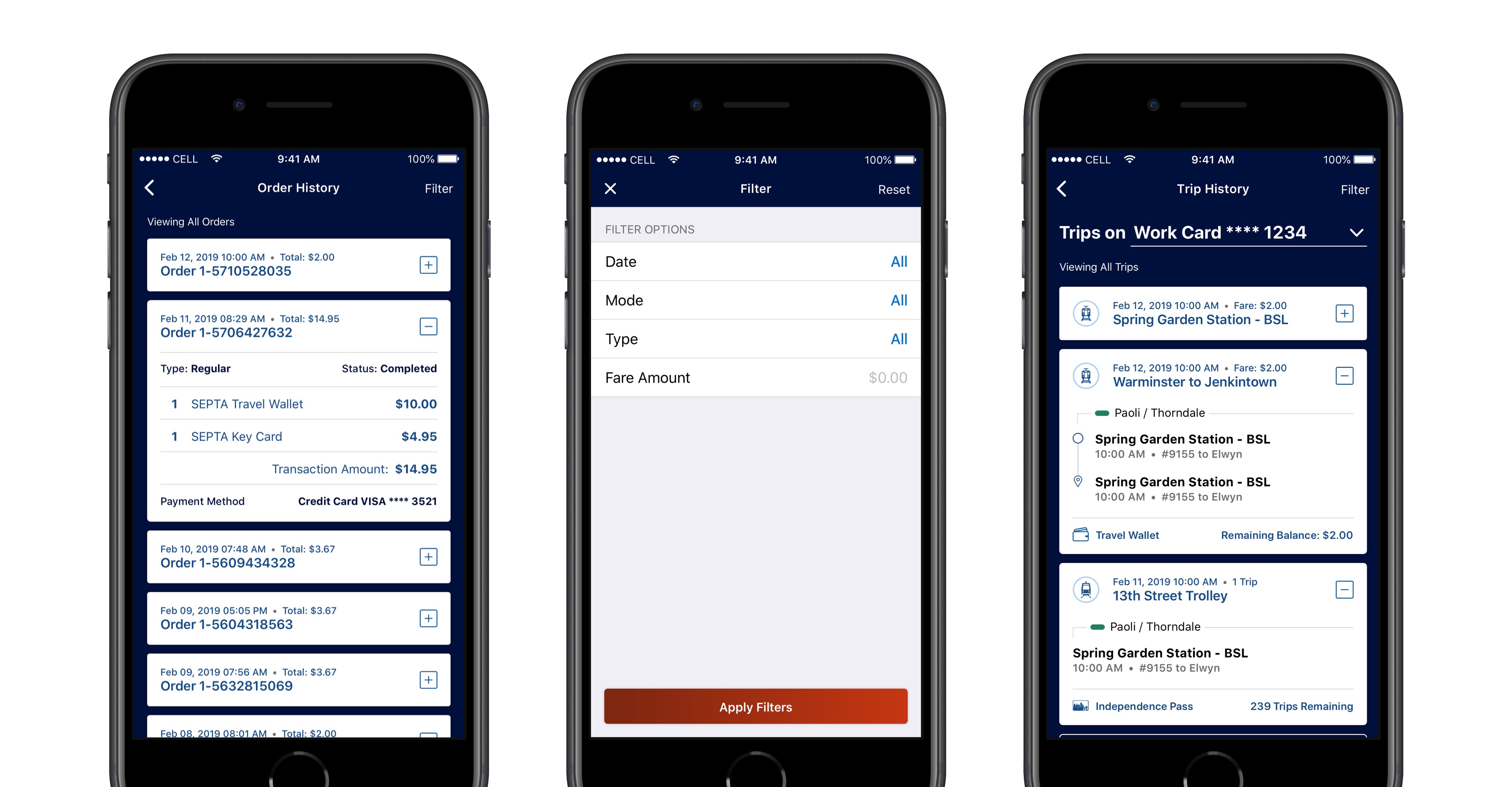
One of the constraints in particular that made designing the Order History view was the information the API provided. We did research to determine which pieces of data the users needed so they could quickly identify and distinguish between transactions without having to expose the transaction details every time to figure this out. Because of the API limitations, we couldn't display some of the additional pieces of information without a significantly detrimental performance impact, so we balanced the information that a user needed to see with what we could display quickly without a second, more robust API call. We also added the ability to filter the history information so a user could more easily narrow down the list of results in a performant manner.
While I feel like the overall aesthetics of the app that were established well before my involvement need improvement, I had a ton of fun working on this and am very proud of how we worked through the various complications and constraints to effectively integrate these new features in the app.
Project Details
Timeline
- 6 Weeks, Completed in February 2019
Team
- Caitlyn Mayers, Product Designer
- Mark Badger, Creative Director