Richmond Symphony
Website Design
When the Richmond Symphony approached Colab about redesigning their website, I couldn't have been more excited about the project. I'm a musician — I began making music as a kid in choirs and eventually worked my way to playing Timpani in my university's Symphony Orchestra and was Principal Percussionist of the university's Wind Symphony as well. The choir I grew up performing with here in Richmond was the Greater Richmond Children's Choir, led by Hope Armstrong Erb. Her father-in-law, the late James Erb, was the choral director of the Richmond Symphony Chorus, and we were lucky enough that whenever a children's choir was needed for one of the orchestral works, we got to perform with them. I have such fond memories of these experiences, and when I was asked to work on this project, I was thrilled beyond belief to help translate the Symphony experience into a new visual language for their website.
Challenge
The Symphony approached us to help them solve a few problems they were experiencing with their old site. The Symphony has an enormous amount of concerts, events and other types of programming. All of this information was contained within the old site, but not organized or presented well. Some of the more technical challenges they faced were a result of the site being unresponsive and lacking a CMS. The Symphony also felt that their old site did not generate a strong emotional connection with the user and wanted their new site to connect with people in a more engaging way and prompt more exploration through the site.
Solution
Strategy
A majority of the strategy work had been completed by the time I joined the project, but I was brought in at the tail end of that phase. I was able to help complete a majority of the wireframes for the site, but what was more important was translating the strategic work – the wires, information architecture and template assignments — into a design system.
I began this process by gathering all of the documentation and outlining patterns of information. One of the benefits of having years of being a musician under my belt was my knowledge of how information should be presented and what types of information would be related and commonly associated with each other, and this made the process of identifying these patterns much smoother.
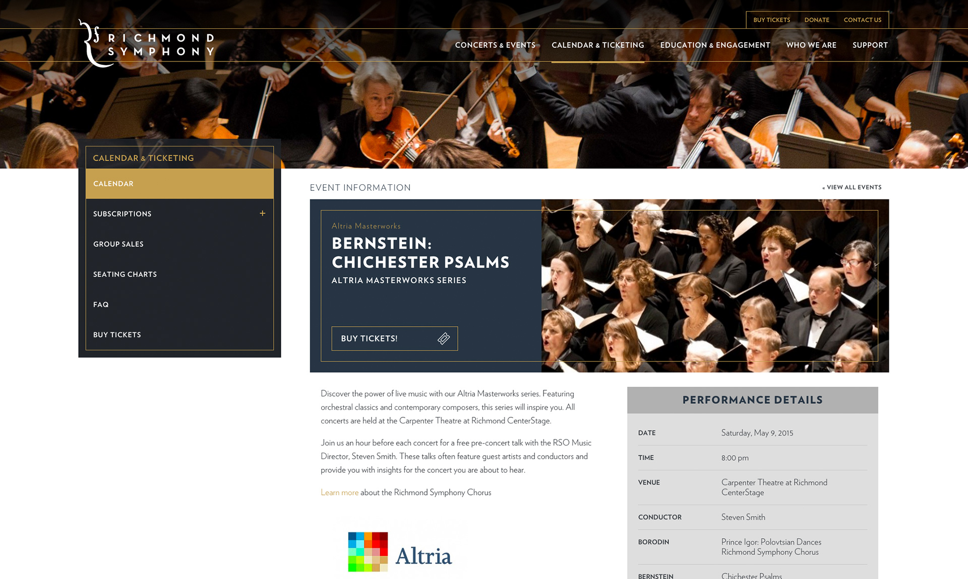
One example of these types of information is concerts. Concerts are, on the surface, a very simple type of information, but as you dig deeper, there are many smaller pieces of data that comprise one concert. A concert has a date, time and location and a set of (typically) 3 pieces/works. Each concert is usually performed twice, an 8pm concert one day and a 3pm concert the next, typically a Saturday/Sunday pairing. Each concert's music has the piece title, any movements or specific information related to the work that is being played, composer name and any soloist or guest conductor information associated with it.
All of these items are important and have different relevant contexts. One of the goals I achieved through this information pattern work was identifying elements with these commonalities - similar to the concert example above - and assigning a weight for each context, which allowed me to determine placement of information across the site and establish consistency.
Design
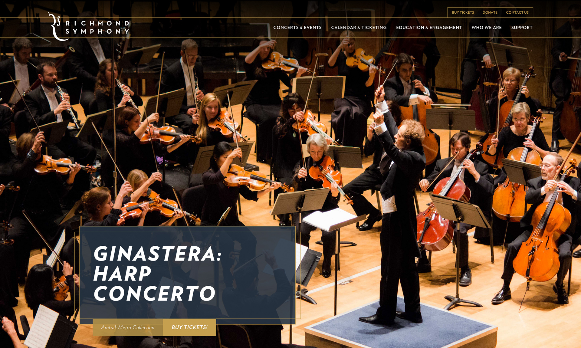
Attending an orchestra concert has always been a rich experience for me. I think of warmth, of reds and golds, of strong lights, soft notes, swelling crescendos and that sigh of relief as the music ends. It was important to me that the site's design captured these feelings and that elements on the pages of the site reminded people of it felt like to experience the music.
Another aspect of the Symphony experience revolves around the musicians — what they see, hear and interact with during the concert. Something that's always stood out to me is the beauty of the visual representation of the notes themselves, and I wanted to use subtle nods to the ink on paper driving the conductor and musicians in the visual elements throughout the site. The navigation lines are a nod to the music staff, the hover and active states for the nav nodes are a nod to whole rests, the alert animation on news items is a nod to sound waves emanating from the musicians and is also in the shape of the orchestra. Using elements like these throughout the site built a cohesion between the concert and online experience that is subtle but very elegant.
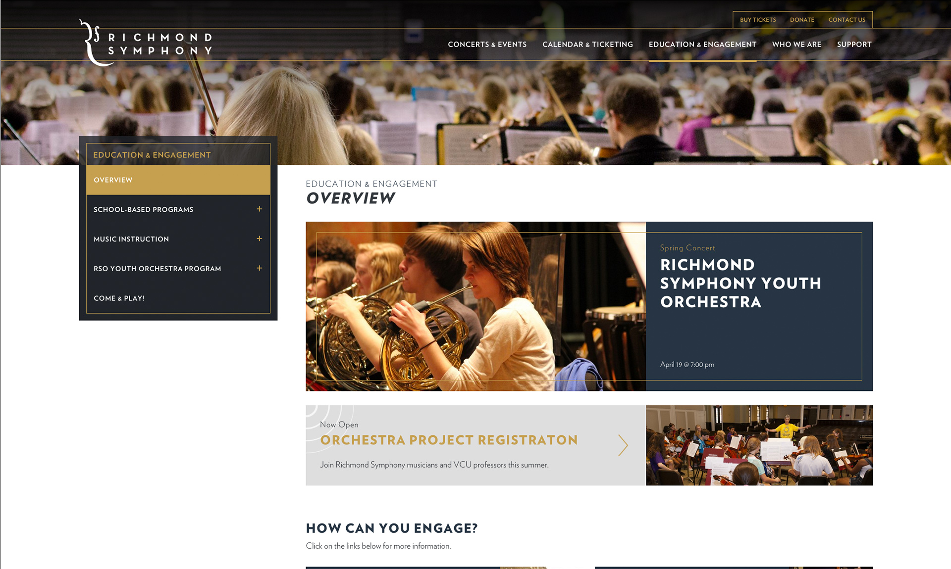
The Symphony's palette was fairly neutral, and I established a baseline palette for the brand that could work with a multitude of additional colors for them. The Symphony has many concert series that they promote and had been using color-coding for these individual series in their print materials. The palette bases chosen were monochrome, gold and navy. I expanded the color-coding they had been doing by adding some depth and richness to those colors to add more cohesion to the palette.
Development
I have always felt that how you physically interact with a device - how you hold it - is just as important a consideration as how you interact with the elements on the screen. We decided to move the navigation trigger to the bottom of the device, which made it much easier to activate and use, especially one-handed.
The developer continued building the navigation for the site, which was modeled after the navigation another coworker had built for another site we had just completed. That site has a split mobile nav, with the primary nav on one side in a separate area and the section nav on the opposite side. I didn't think this was intuitive or usable, and I felt that we should consolidate the complicated nav on the Symphony site. This would allow users to move through the site in the same manner no matter where they were on the site.
We decided to keep the nav functionality as true to the desktop site as possible - allowing users to jump into a section or view the section's content before interacting with the links. We also determined that moving back and forth between tiers in sections was very important, so we added the section context and back links to the mobile navigation so users could move back through the sections if they didn't find what they were looking for instead of being siloed and then abandoning all hope.
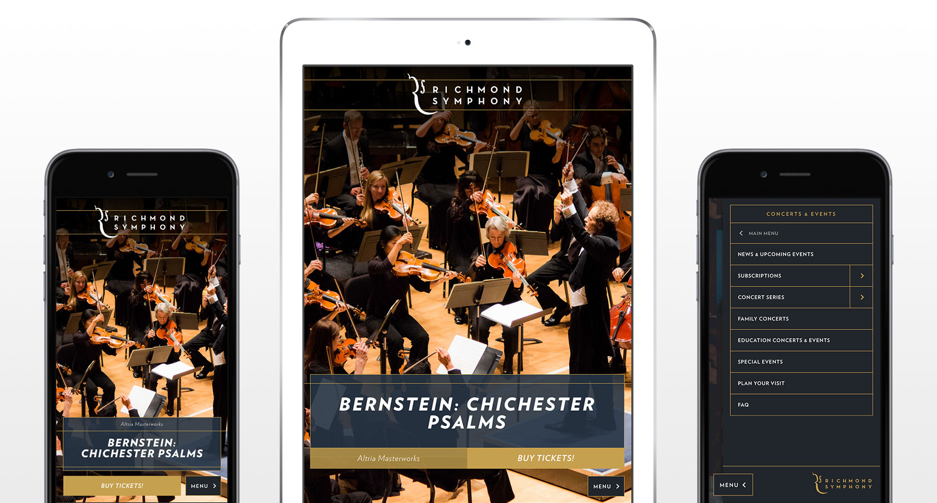
Working on this project was a joy, and it was such an honor to be a part of the team. I absolutely love this site's design, but the work I'm most proud of is the mobile navigation's usability after taking the time to refine it. My greatest hope for this project is that our work will help the Richmond Symphony and its partner organizations continue to create experiences for our community that have as much impact and meaning for those that experience them as they did for me.
Team
- Caitlyn Mayers, UX & Visual Designer
- Mike Colicchio, Project Manager
- Josh Scarbrough, UX Designer & Developer
- Work done at Colab