Horsley Real Estate
Website Design
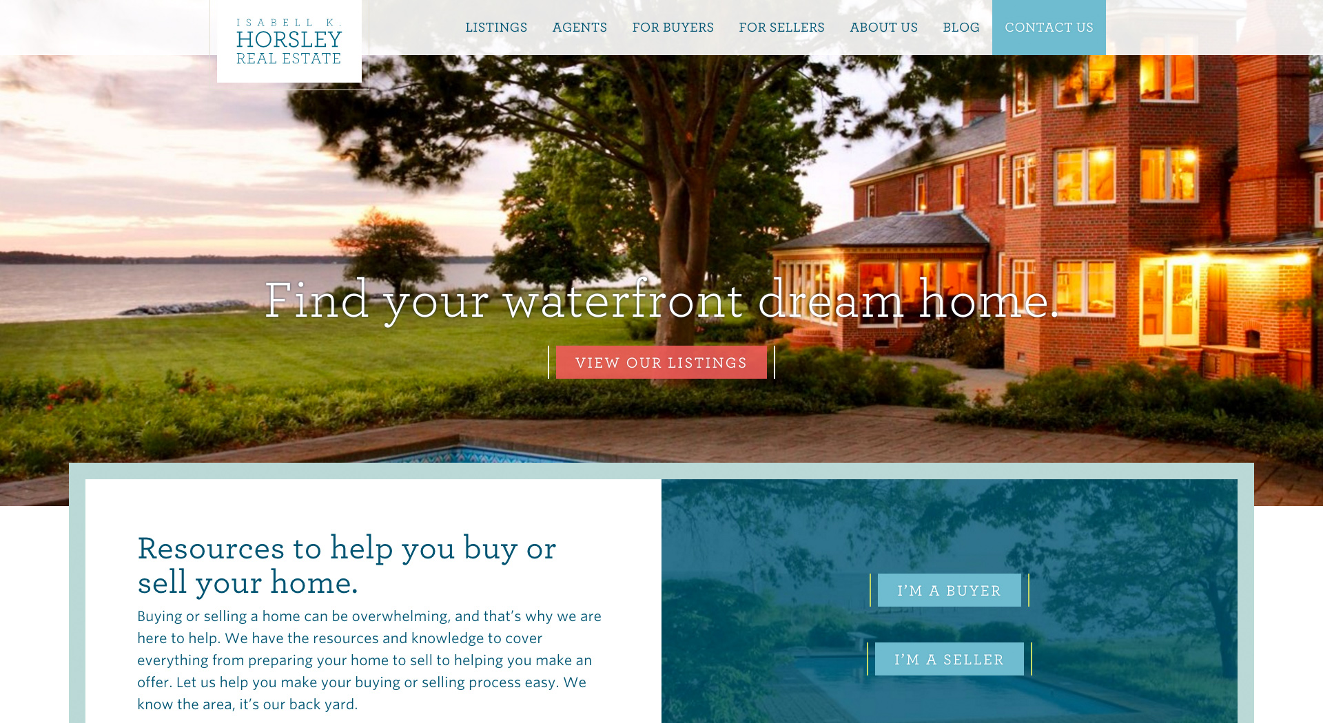
For Virginians, the water holds a special place in our hearts. Many of us spend time on the water in the summers, and I am fortunate that my in-laws have a home on the Rivah (the Rappahannock River) that we can use as a weekend retreat. Being at the Rivah is a unique experience — life slows down a bit and you're able to relax and be present in the moments with those around you. These waterfront homes are in high demand, and Colab partnered with Horsley Real Estate, a group of Virginia waterfront real estate specialists, to create their new website.
Challenge
Horsley Real Estate’s website contains a significant amount of listing-focused content. Their previous site was not editable via CMS, and the first priority was to create an administration experience that was much easier than the old site to maintain and update information. The old site wasn't responsive, had an aesthetic that was dated and was structured in a way that made it difficult to find listings and easily read the listing information - the listing information was mostly embedded in images.
Solution
Strategy
The primary focus for the site was on the listings. I conducted research into real estate sites, examining what worked well and what didn't, but I found that most real estate sites weren't what I would consider usable, nor did I think that they presented the key information at relevant points in the user journey. I pivoted the research and began looking at travel lodging booking sites, such as HomeAway and Airbnb, and began seeing functionality, interaction patterns and content/context that I felt were much more usable.
There were two listing contexts - the listing overview page and the listing single page. I wanted each context to have consistency in presentation and created the listing overview structure before the listing single. I created a card for each listing, featuring key information to allow users to more easily scan and qualify the listing as meeting their needs or not quite fitting the bill. This information includes the listing name, price, agent, location and description, as well as a 3-photo gallery of the listing.
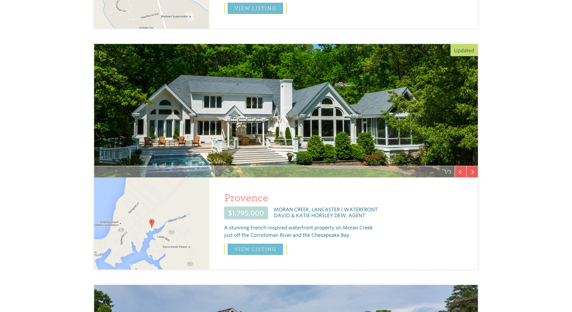
Something I didn't like about other real estate sites was the fact that you only saw one image for the listing in the overview context. I wanted to give users a few more photos so they could begin to visualize the space and features of the listing without having to click into the listing.
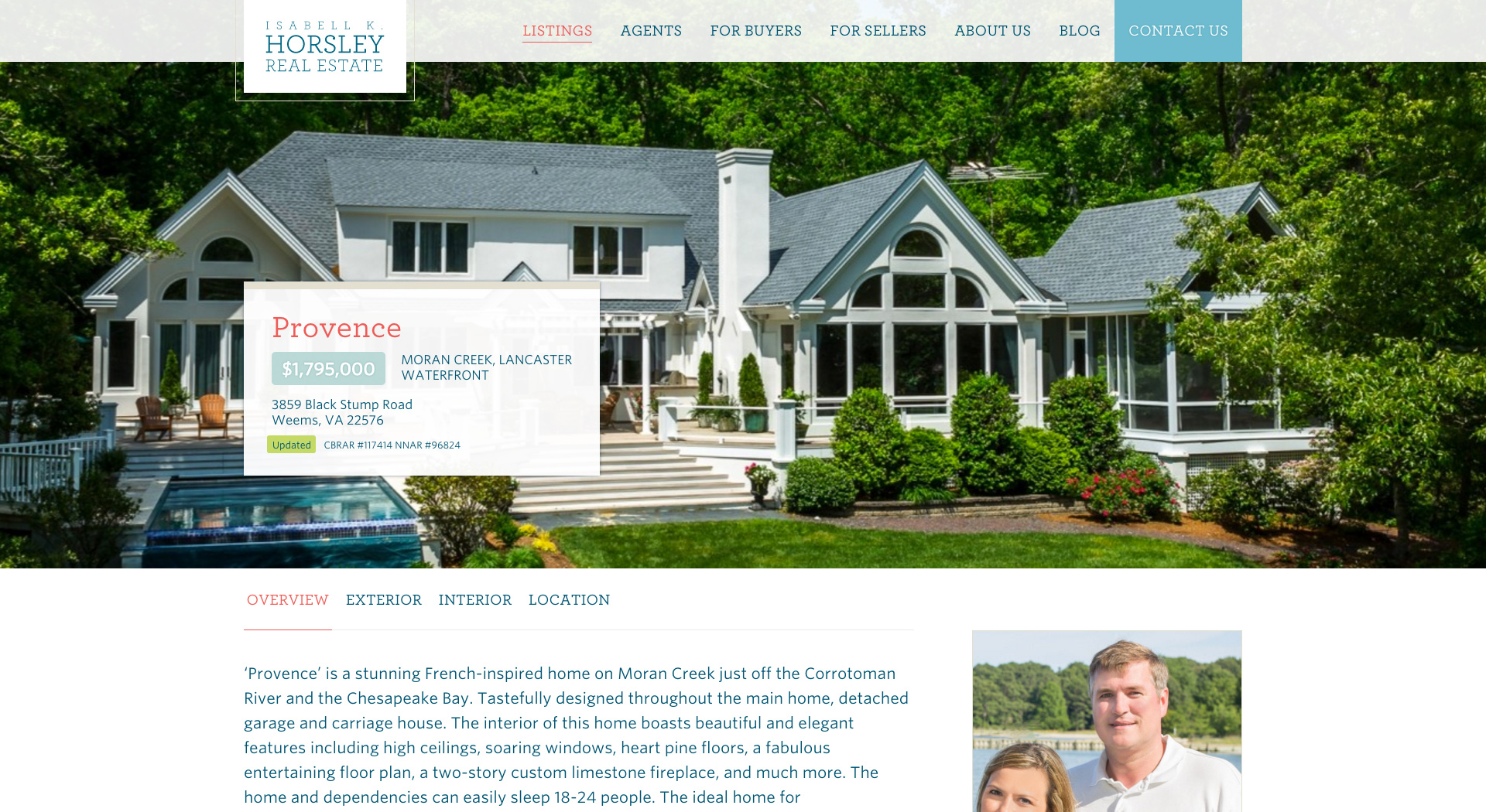
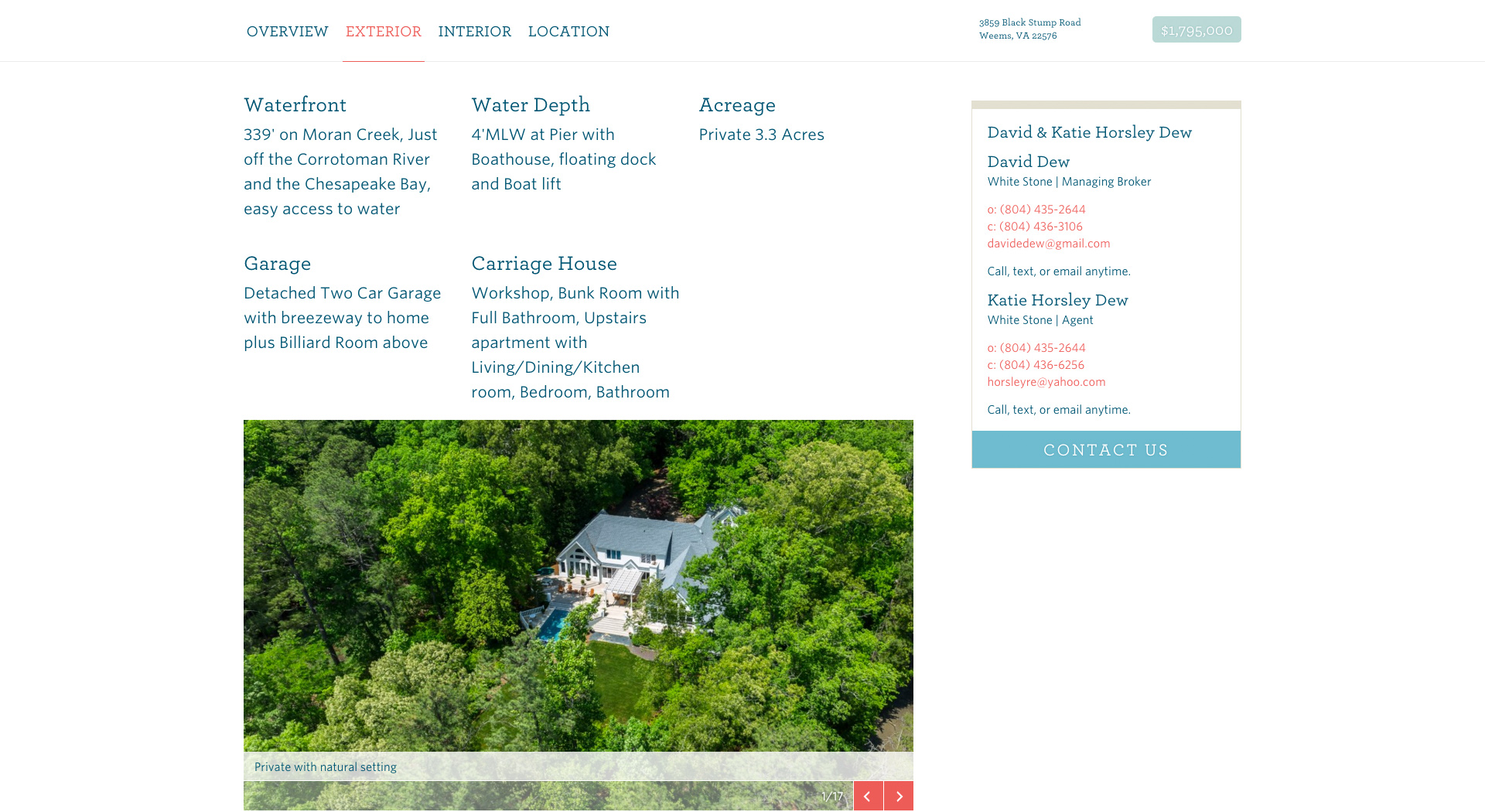
The listing single contains much more information and needed to be broken into digestable chunks. Moving through the content, we created a structure that began at a global level and then drilled down into more detailed sections. Each listing has the meta overview at the top, with name, price location and MLS info. The content underneath that section is then organized as follows: Overview, Exterior, Interior, Additional Photos and Location. By creating these content sections, users can now more easily parse the information and understand what they're reading about instead of having to dig to find what they're looking for.
We were fortunate that Horsley had access to a wealth of photos and videos for their listings, and we wanted to use as many of these images as possible. Instead of creating one giant gallery of photos, we added the option to embed a gallery in any of the sections and created an additional photos section where they could place other photos if they so chose.
An agent card was also added to the listing single to provide a way for users to contact the listing's agent. This card, along with the section navigation and condensed listing overview, pins to the top of the page when the page is scrolled. By pinning these items to the page when the page is scrolled, a user can still see what the address and price are, use the section navigation to move through content and see the agent information at any point they decide they would like to inquire about the listing.
Design
I knew that this site had to have a certain look and feel, and immediately created a color palette that evoked a reaction that reminded you of the water. I'd been wanting to use Hoefler & Co.'s Archer since I saw it for the first time a few years ago on the Oscars materials, and I knew that it had just the right character for this site. I paired the Archer with another Hoefler typeface, Whitney, and I'm very pleased with how they compliment each other. The photography I had access to was unusually good, and I was able to feature their photos prominently and chose to let the design compliment those photos as much as possible.
What I'm exceptionally proud of with this site is how well it's performed since we deployed it. Since deploy, the number of pages per session is 10, the average session duration is 9 minutes and the bounce rate is 32%. People are moving through the site, spending time on the site, and I'm thrilled to see this work performing well for such a great client.
Team
- Caitlyn Mayers, UX & Visual Designer
- Sarah Sheldon, Project Manager
- Dylan James Wagner, Developer
- Work done at Colab