Casa del Barco
Branding & Environmental Design
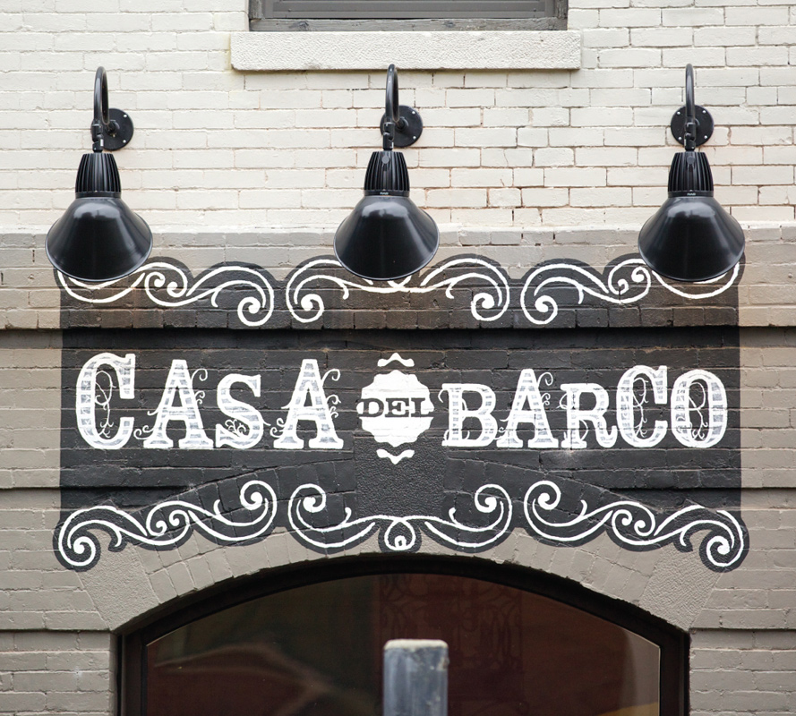
While in the midst of a full-course rebrand for one of our restaurant clients, The Boathouse The Flores Shop jumped on board to help launch their new Mexican concept restaurant, Casa del Barco. The original logo and identity development project grew into a more comprehensive environmental branding, literally from the ground up. We had the privilege of working with interior designer Helen Reed throughout the building demolition, construction and finishing phases.
Concept
We started concepting and created moodboards around the themes of family, food, tequila, honoring the dead, cigar boxes, sugar skulls and old world rustic textures and layers. We referred back to these initial boards as inspiration throughout the process as the branding and design grew. The logo was influenced by ornamental type, hand lettered and painted signage, and wrought-iron scrollwork and filigree. From there we created custom artwork and patterns that we used as layers in the different components – everything had a sepia, leathery, weathered kind of feel. Our identity was rough-hewn and subdued compared to the loud and colorful, stereotypical notion of Mexican. Avoiding these cliches was essential and we found ourselves teaching various members of the Casa del Barco team what this other side of Mexico looks and feels like.
Brand Elements
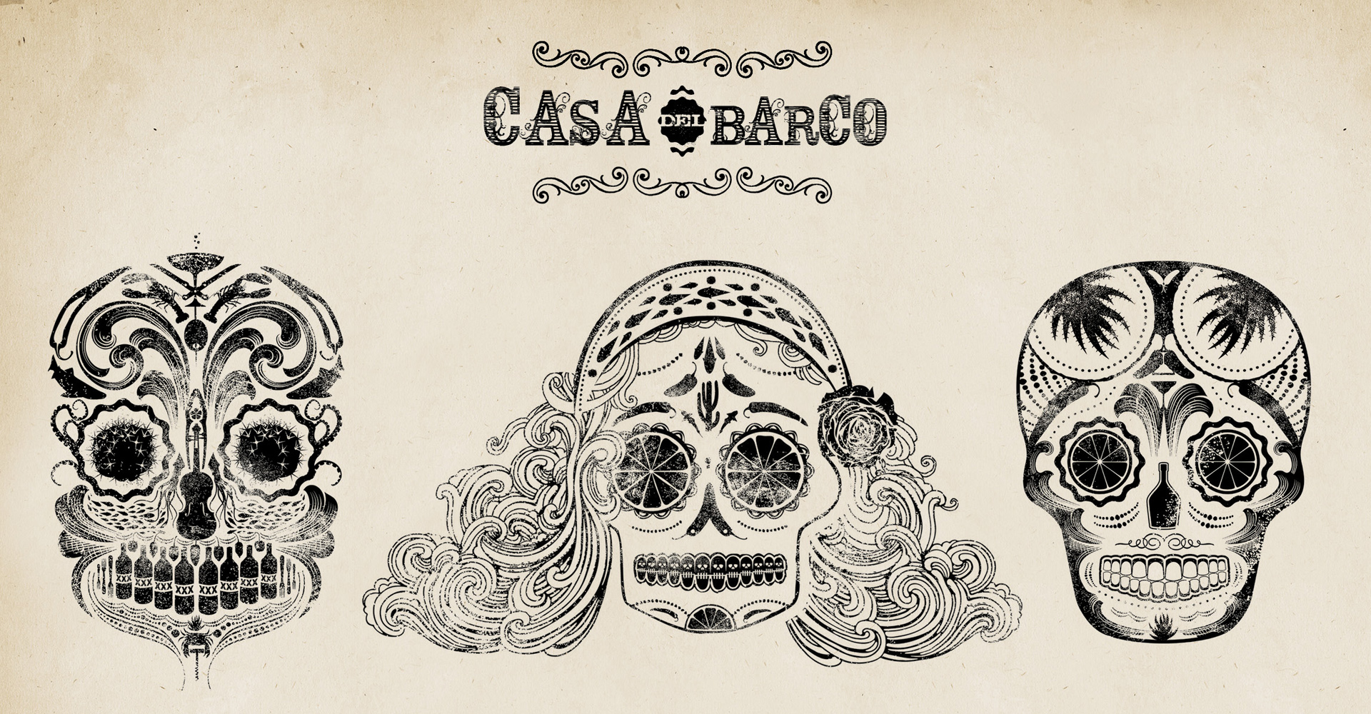
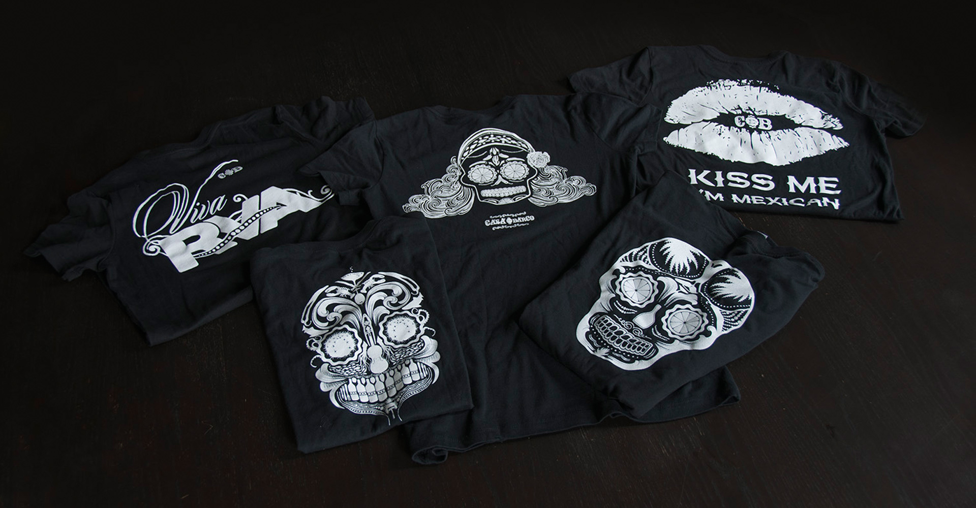
Early on in the project, we knew we wanted to create sugar skulls and use them as an integral part of the brand. Our design team went to work illustrating what we felt was a sugar skull that was representative of the Casa brand. The series of sugar skulls we illustrated each came to represent a different personality. We each chose a different conceptual direction and pursued our own interpretations of what our sugar skull would embody. Kevin's skull represented time-honored Mexican imagery, focusing on food and using elements such as shellfish and seafood, bottles and a guitar. Jordan's represented that firey Latin woman, a feminine depiction of a sugar skull with peppers, flowers and the waves of the ocean.
I created the third skull in the series, whom I affectionately named San Mateo after the Patron Saint of Sobriety. This skull was entirely tequila themed, utilizing graphic elements centered around drinking tequila: agave, citrus, jalapeño, margarita and shot glasses. We used this skull extensively throughout the brand, from flasks to barware and for my favorite application of the skull, die-cut business cards.
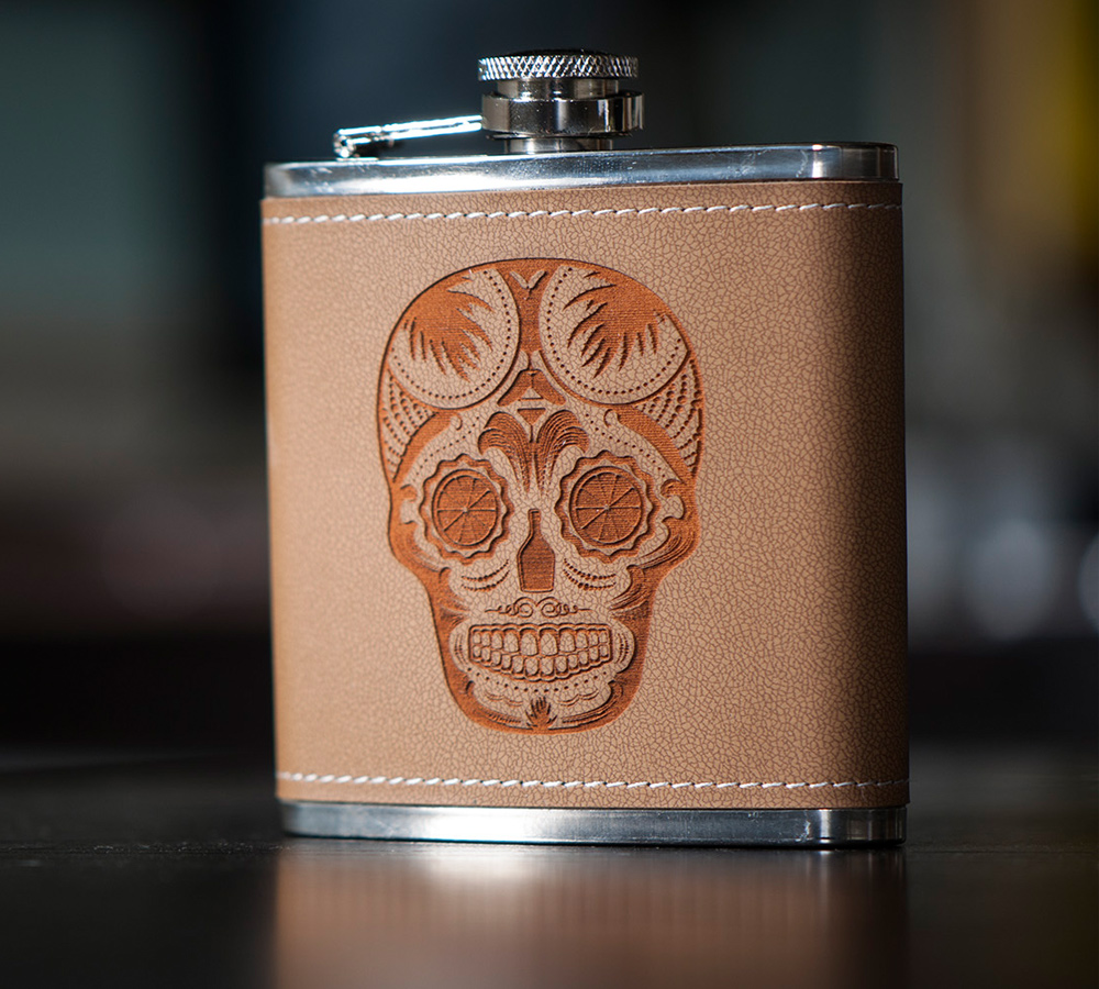

We developed an entire retail arm of the brand, most of which to our great delight, we were able to produce. This portion of the design led to some of the restaurant supply (barware, coasters, menus and binders, check clipboard, to-go bag and container labels) and influenced the staff uniforms. The t-shirts, flasks, iPhone cases, and temporary tattoos were an exercise in vendor sourcing and all exceeded our expectations. Everybody at The Flores Shop was part of constructing the brand and it was one of our most collaborative efforts to date – from designs to production methods and materials.
Environment
The interior furnishings and fixtures were functional components and another area where we wove subtle elements and textures into the mix. We wanted the new space to feel rustic and rough, recycled but also refined. Instead of putting up plain acoustic panels (in consideration of the loft dwellers above), Jordan led the effort to create graphics that were printed on the acoustic substrate, allowing the ceiling to fade and blend into the other architectural features of the restaurant. We carried these elements throughout the interior graphics, exterior signage, website and collateral materials.
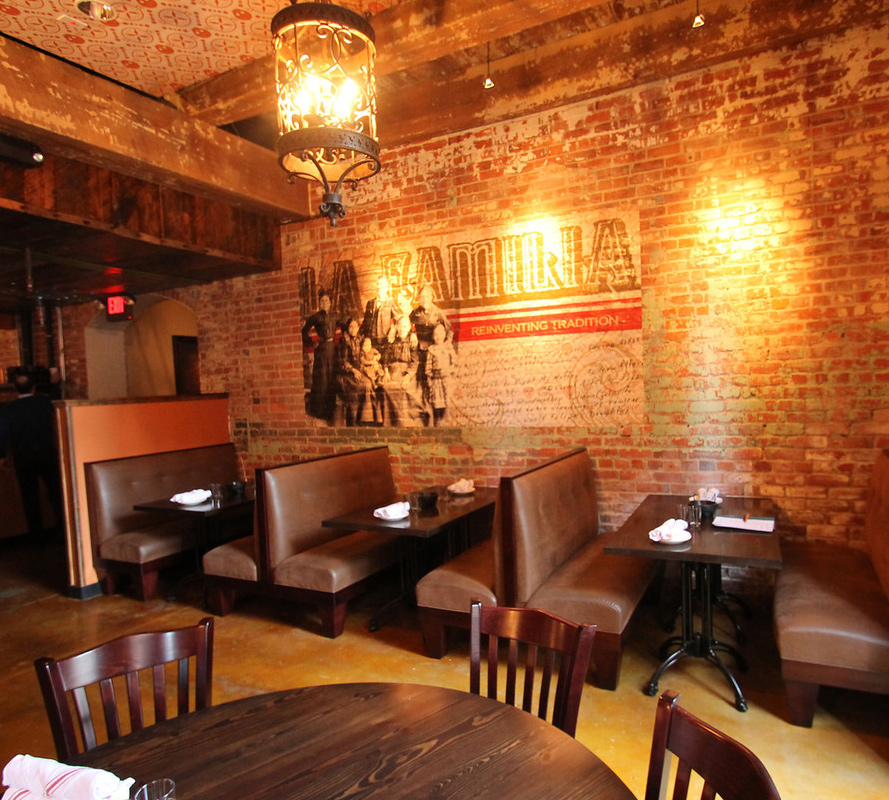
Our intent in every execution was to pay respect: to the history of the building, the origination of the menu, Mexico and also with a nod to Richmond, and the families – past and present – who are part of it all. Casa Del Barco is an homage to the past, and the heritage of the building as well. Via the food, branding and environmental design, we nod to the history of Mexico, its people and its cuisine.
Team
- Caitlyn Mayers, Designer
- Kevin Flores - Creative Director
- Sarah Sheldon - Project Manager
- Jordan Schmidt - Designer
- Work done at The Flores Shop