Experience 360°
Branding
A few months ago, one of my good friends from college, Ryan Moore, gave me a call to see if I'd be interested in helping his company, Experience 360°, with a rebrand. Ryan and I spent a ton of time together in Orchestra and Wind Symphony and we were both in the School of Visual Art and Design — Ryan studied film while I studied design. We first worked together branding the university's end of the year film project that Ryan directed — The Strawberry Festival — and I couldn't pass up the opportunity to work with him again on Experience 360°'s new visual identity.
Concept
This brand required almost as much malleability / flexibility as a brewery brand does - the mark has a variety of applications across different media, and it was important that I understood the needs of the identity and how it needed to live in order to be something they could use long-term.
This new logo needed to be sleek, minimalist and representative of the VR experience. It also needed to capture the vibrance and excitement of this new content arena. One thing I felt was very important, though, was that this brand needed to be responsive. I believe that the same principle applied to responsive websites — that the content should be adapted to its optimum structure for its medium — should be applied in branding as well, specifically with logos. The logo should be designed to break down as it incurs space constraints. This was important to establish with the Experience 360° logo so that it could work well in a variety of applications with unique technical demands and design needs.

Brand Elements
Icon
The icon is a simple visual descriptor of Experience 360°. It is comprised of two circles that form a unit. The large circle represents the roundness and circularity, the whole-ness of the experience. The small circle represents the degree indicator. The interplay/relationship of the two elements is very descriptive: this icon demonstrates Experience 360° connecting the viewer to a larger world of VR/immersive content and also represents connecting a singular event or experience to a huge audience around the globe. This icon connotes an eco or solar system of two items that are closely intertwined, which adds a bit of depth to this mark. This connectedness also demonstrates an integration of the two shapes, which is an important value proposition Experience 360° offers content producers: seamless integration and understanding of process.
System
Depending on the constraints of the platform, the logo can be broken down and abbreviated in order to be optimized for its application.


Color
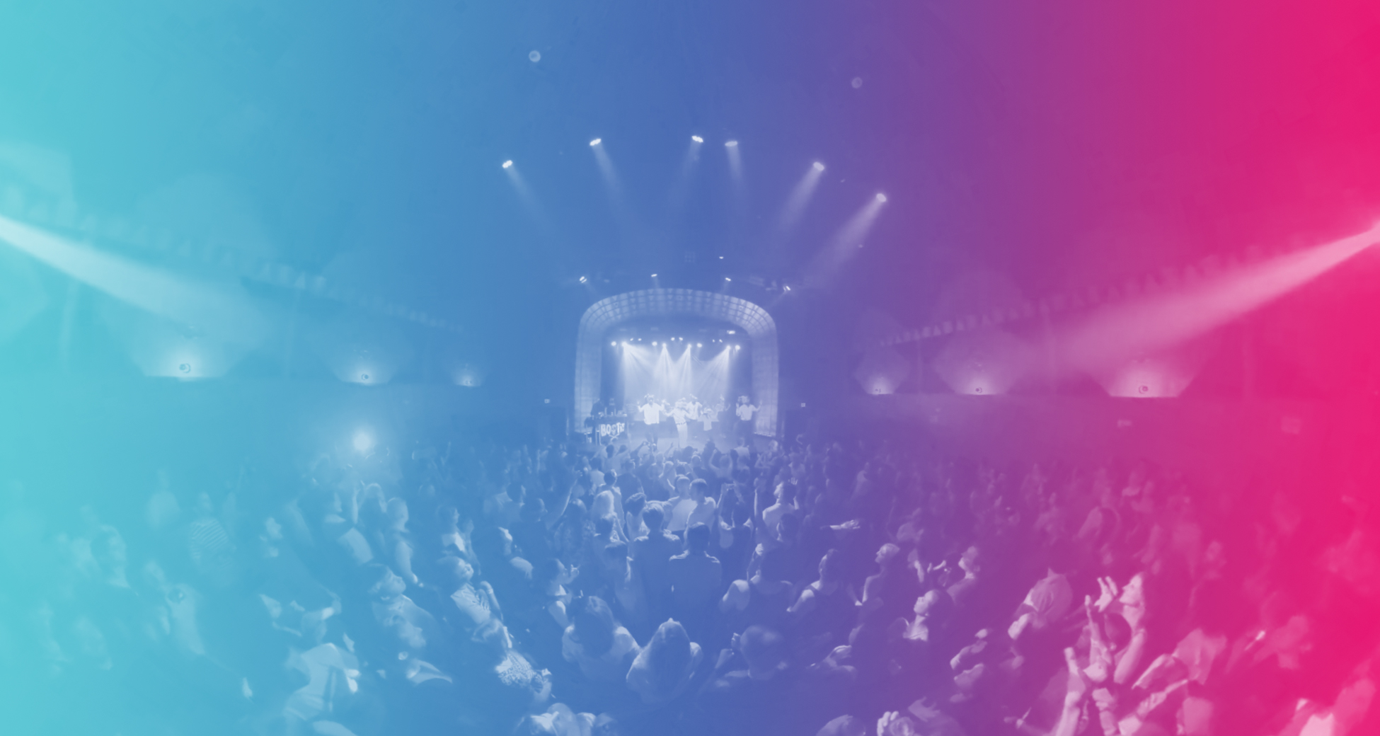
Continuing with the theme of flexibility, I wanted to create a diverse color palette for Experience 360° to pull from as their needs demanded. Versatility in colors allows the palette to be changed based on the mood or style of image. It opens up the possibility for color-coding various product or experience types. Ultimately, it allows Experience 360° to capture and demonstrate a range of emotions and feelings with the brand. In thinking about how this brand would live and breathe on various media, I explored what a business card would look like. I looked at really cool materials that could be used to manufacture the cards and was very inspired by silver foil.
What I love about the foil is that it changes color based on your viewing angle, displaying a unique design to each person viewing. I felt that this translated part of the 360 video experience into a printed piece, and this idea of capturing an entire spectrum to display to each person fits right into the flexibility of this identity. I used this as my inspiraton for the color palette.

We're just getting started rolling out this new identity. Ryan and his crew at Experience 360° are hard at work producing VR content, and I am looking forward to seeing where they take this brand as they continue to pioneer this exciting new arena of content.